Chapter 11 Transformative Changes: Coordinate System Transformations
This chapter introduces the SVG transform attribute, and examines the ways in which you can work with the SVG coordinate system to make the most of transformations.
Like the nested coordinate systems created with <svg> and <symbol>, transformations allow you to reposition your origin or change the scale of your units. But transformations don’t stop there.
Transformations can change the definition of what “horizontal” or “vertical” means. This means you can draw rectangles and ellipses that don’t align with the browser window, without having to use <path> notation and trigonometry.
Furthermore, while new coordinate systems must be defined with a separate <svg> or <symbol> element, a transform can be applied directly—as an attribute—on individual shapes or on groups. This makes transformations incredibly flexible, and they are widely used in SVG.
Since transformations control the geometry of your drawing, transform was originally defined as a core XML attribute. However, transformations are so useful that web designers wanted to use them for non-SVG content.
The CSS Transforms module defines how transformations can be set using CSS style rules, for any content controlled by CSS.
Figures and Examples#
The file names link to the code view on GitHub. Beware: the linked screenshots are hi-resolution; some have very large file sizes.
View all files for this chapter on GitHub.
 Figure 11-1. A heart icon at many scales
- Example 11-1. Scaling an icon with
<symbol>and<use> - Example 11-2. Scaling an icon with transformations
 Figure 11-2. Scaling a heart icon within a centered coordinate system
- Example 11-3. Centering an icon within the coordinate system to control the scaling origin
 Figure 11-3. Stroked circles at various scales
- Example 11-4. Scaling a stroked shape
 Another example of non-uniform scales (which was cut from the book)
 Figure 11-4. Mirrored text created with negative scaling factors
- Example 11-5. Using negative scaling factors to create reflections of text
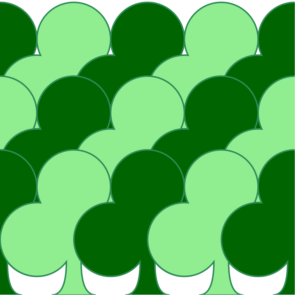
 Figure 11-5. A forest pattern created with translated club icons
- Example 11-6. Using translations to position a repeated icon
 Figure 11-6. Scaling a heart icon after centering it with translations
- Example 11-7. Using translations to center a coordinate system for scaling
 Figure 11-7. A wreath of icons created with rotations
- Example 11-8. Rotating a graphic around the origin
 Figure 11-8. A complex pattern created by rotating a single icon around two centers
- Example 11-9. Rotations around arbitrary points
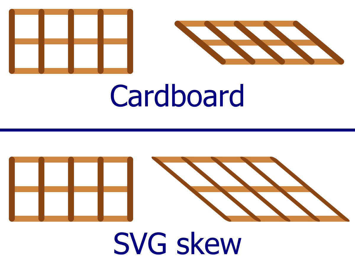
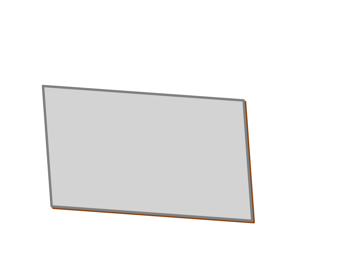
 Figure 11-9. Understanding skew: flattening a cardboard grid versus skewing an SVG grid
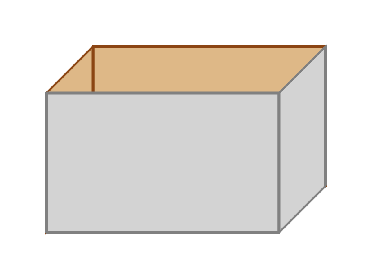
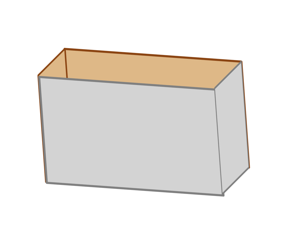
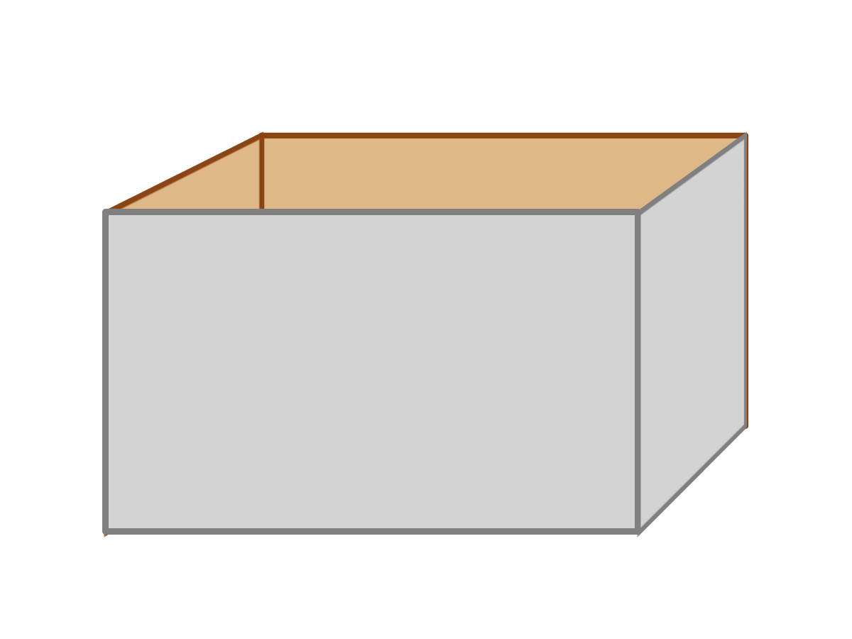
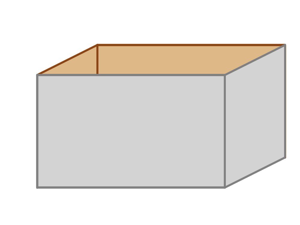
 Figure 11-10 and 11-X2. A pseudo-3D drawing of a box built from skewed rectangles
- Example 11-10. Using skew transformations to simulate three dimensions
 Figure 11-11. Text with a projected shadow created with skew transformations
- Example 11-11. Creating a projected shadow effect with skew transformations
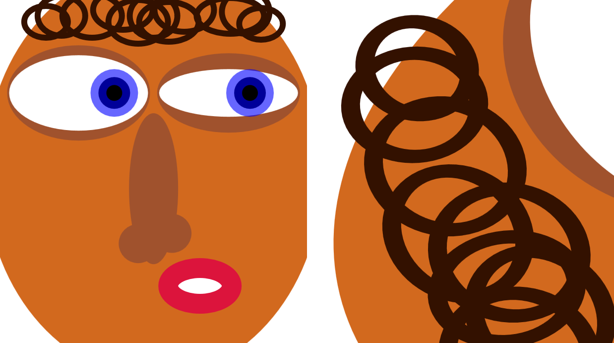
 Figure 11-12. An SVG face, and the same drawing with a matrix transformation applied
-
- Live SVG file,
face-matrix.svg (the code isn't exactly as described in the book: to have before and after versions in the same figure, it uses a
transformon a<use>instead of a<g>) - PNG screenshot, face-matrix.png
- Live SVG file,
face-matrix.svg (the code isn't exactly as described in the book: to have before and after versions in the same figure, it uses a
 Figure 11-X1. A schematic for determining the direction of the z axis in a left-handed coordinate system
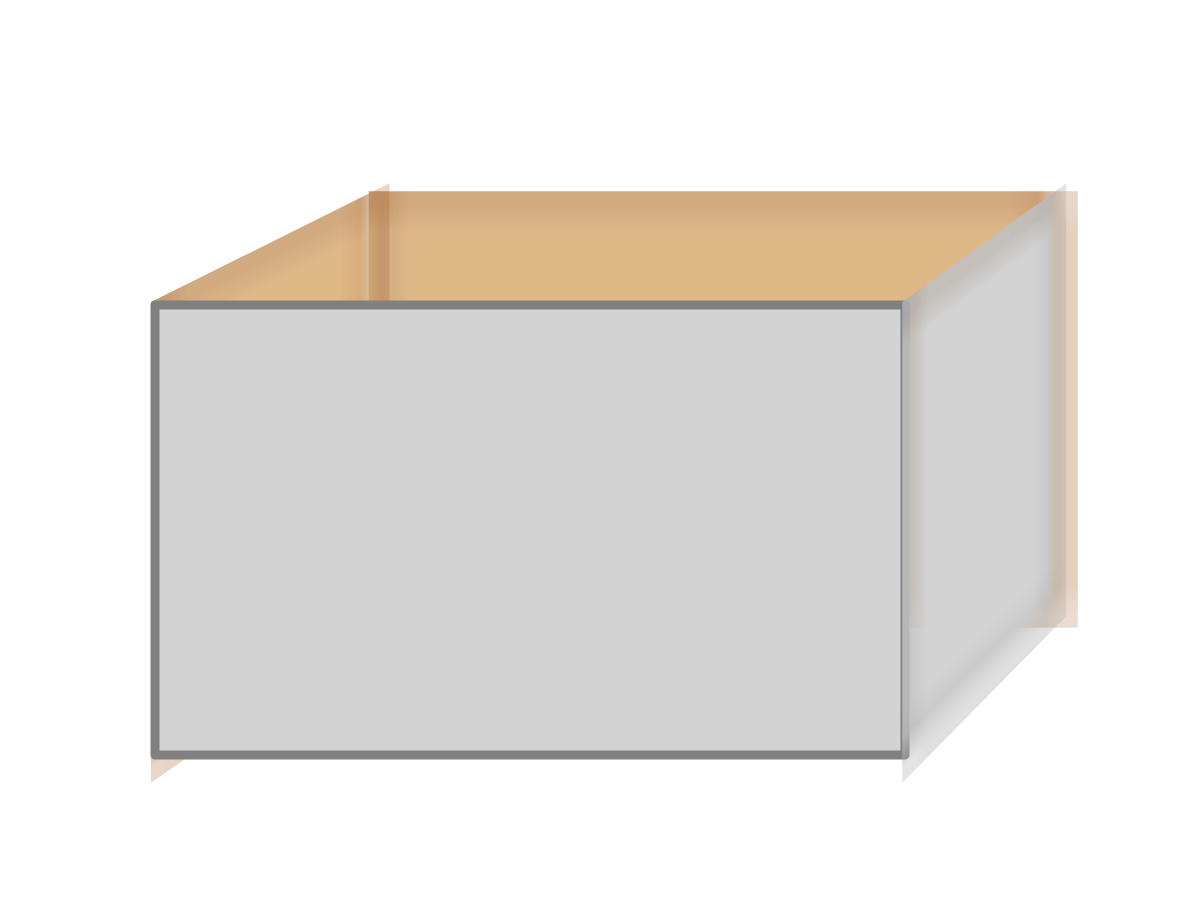
 Figure 11-X3. A 3D “box”, when each side is flattened onto a canvas before the canvas is tilted towards the viewer
- Example 11-X1. Using 3D transformations to build a box in preserve-3d space
 Figure 11-X4. A 3D box, tilted towards a viewer at an infinite perspective distance
- Example 11-X2. Using 3D transformations to build a box in preserve-3d space
 Figure 11-X5. A 3D box, viewed from above and to the side (as rendered in Firefox 54)
- Example 11-X3. Using 3D transformations to build a box, and 3D perspective to display it
 Figure 11-X6. A 3D box, viewed from above and to the side, as rendered in Firefox 54 after changing the viewBox scale to match the display scale
 Figure 11-X7. A 3D box, viewed from above and to the side, as rendered in Chrome 57 after converting perspective effects into transform function lists
- Example 11-X4. Integrating 3D perspective effects in an individual element’s transformation sequence
 Figure 11-X8. Text that casts a shadow in three dimensions
 Figure 11-X9. Text that casts a shadow in three dimensions, in a different browser
- Example 11-X5. Using 3D transformations to cast a shadow
Online Extras#
- “The Next Dimension: 3D Transformations”: CSS transforms include 3D effects. How do they work, and how do you work around the browser bugs for SVG?
- Reference: Transform Functions