Media Queries in Embedded Versus Inline SVG
Media queries are incredibly useful—in SVG and in web design in general—to adapt styles to different devices. They can be used with inline SVG and in standalone SVG files. But if you’re switching between the two, you’ll often need to make adjustments.
As we warned in the book (in the section “Media queries” of Chapter 3), the media being tested is the window or printed page for the document containing the SVG code. If the SVG is inline within HTML 5, that means the entire frame containing the HTML web page. However, if the SVG is embedded as an <object> or <img>, it means the specific frame area created to draw the graphic.
Example 3-X1 constructs a simplified graphic to demonstrate the difference.
The graphic is used both as inline SVG and as an embedded SVG file—the same markup, copied and pasted. The same CSS file is used for both, as an external stylesheet. Inside the CSS file is a media query that tests the size of the document region, and reduces the thick stroke width when the document is small.
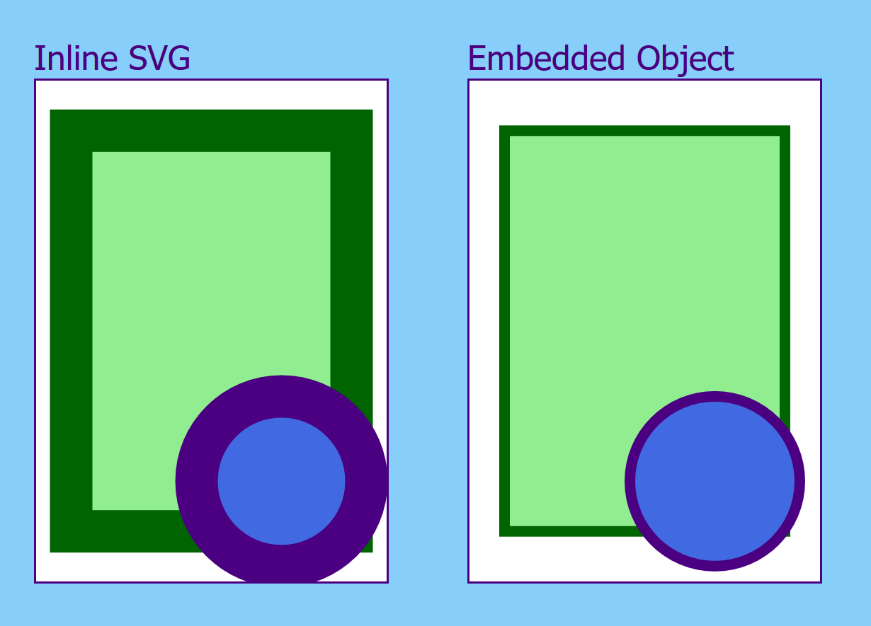
Example 3-X1. Interpretation of Media Queries in Inline versus Embedded SVG
CSS styles: mediaquery.css
rect{fill:lightGreen;stroke:darkGreen;}circle{fill:royalBlue;stroke:indigo;}rect,circle{stroke-width:20px;}@media(max-width:200px),(max-height:200px){rect,circle{stroke-width:5px;}}
Embedded SVG file: mediaquery-embedded.svg
<?xml-stylesheet href="mediaquery.css" ?><svgxmlns="http://www.w3.org/2000/svg"xml:lang="en"><title>Stylable Shapes, in an SVG File</title><rectx="10%"y="10%"height="80%"width="80%"/><circlecx="70%"cy="80%"r="40px"/></svg>
HTML markup:
<!DOCTYPE html><htmllang="en"><head><title>Using Media Queries with Embedded and Inline SVG</title><linkrel="stylesheet"href="mediaquery.css"/><style>/* styles for the HTML page itself */body{background:lightSkyBlue;color:indigo;font-family:sans-serif;margin:0;display:flex;}figure{display:inline-block;/* if flex-box not supported */width:45%;margin:1em;padding:0;}svg.inline,object{border:solidthin;background:white;width:100%;height:200px;/* if vh units not supported */height:calc(100vh-4em);}</style></head><body><figure><figcaption>Inline SVG</figcaption><svgclass="inline"><title>Stylable Shapes, Inline</title><rectx="10%"y="10%"height="80%"width="80%"/><circlecx="70%"cy="80%"r="40px"/></svg></figure><figure><figcaption>Embedded Object</figcaption><objecttype="image/svg+xml"data="mediaquery-embedded.svg"></object></figure></body></html>
A screenshot of the result on a small screen is shown in Figure 3-X1. At this size, the height and width for the embedded object have triggered the media query, but the overall document dimensions, used for the styles on the inline SVG, have not.
View the live example in a separate tab.
Although this example was simple, focusing on the complications, media queries add considerable flexibility to your SVG code. In Chapter 7, we show a more realistic example, using media queries to adjust text size when the scale of an image changes.