Perplexing Percentages
Nearly every length measurement in SVG can be expressed by a percentage. With a few exceptions, those percentages are relative to the SVG coordinate system size—the size defined by the viewBox of the nearest ancestor <svg> or <symbol> (or by its actual width and height, if it doesn’t have a viewBox).
Percentages in horizontal lengths are proportional to the coordinate system width. Percentages in vertical lengths are proportional to the coordinate system height.
But some lengths in SVG aren’t either strictly horizontal or vertical:
-
the radius (
r) of<circle>and<radialGradient>elements -
lengths within stroke properties:
stroke-width,stroke-dasharray, andstroke-dashoffset
Tip
Font-related lengths (such as for font-size and baseline-shift) are also neither strictly horizontal or strictly vertical. But those properties have their own way of interpreting percentages.
Percentages in the radius and stroke properties are also proportional to the coordinate system size, but in a way that combines the width and height in to a single reference value.
These values can be thought of as “diagonal” lengths, because the percentages grow and shrink in proportion to the length of the diagonal of the SVG coordinate system.
But it’s not that simple. They aren’t percentages of the diagonal length. Instead, the value of 100% is adjusted to maintain the relationship from Pythagoras’ theorem.
Pythagoras’ theorem (as you might remember from geometry class) says that in a right-angled triangle, the square of the length of the diagonal always equals the sum of the squares of the horizontal and vertical lengths.
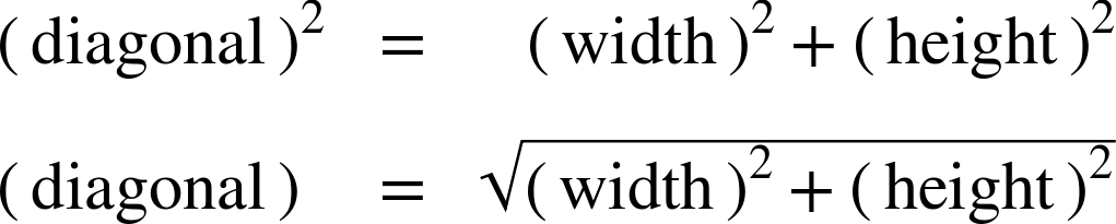
For example, if a rectangle is 4-inches wide and 3-inches tall, the diagonal will be 5-inches long, as shown in Figure 25-1. You may have even memorized a few “Pythagorean triple” sets like this, where the numbers are all nice neat integers.

In general, you can’t use Pythagoras’ theorem with SVG percentages, because 1% height is a different unit than 1% width. However, if a rectangle is 100% wide (measured by the width of the SVG) and 100% tall (measured by the height of the SVG), the diagonal (measured using the formula for circle radius) will equal √2 × 100%, or 141.4214…%.
The absolute distance of the diagonal (calculated using Pythagoras’ theorem) can therefore be used to figure out just how big a percentage circle will be. For example, in a 3×4-inch SVG, the diagonal is 5 inches, so that means 5 inches equals 141-ish-%. From there, you can calculate that 100% in the “diagonal percentages” would be (5in / 1.41), or approximately 3.53in.
If your SVG is square, however—say, 200px by 200px—then the numbers get a little nicer. The SVG’s full diagonal length would be √2 × 200px (approximately 282px), but 100% in diagonal mode would be (√2 × 200px)/(√2), or exactly 200px.
Tip
In the special case of a square SVG, 1% is 1% is 1%, no matter how you measure it.
The general formula is as follows:
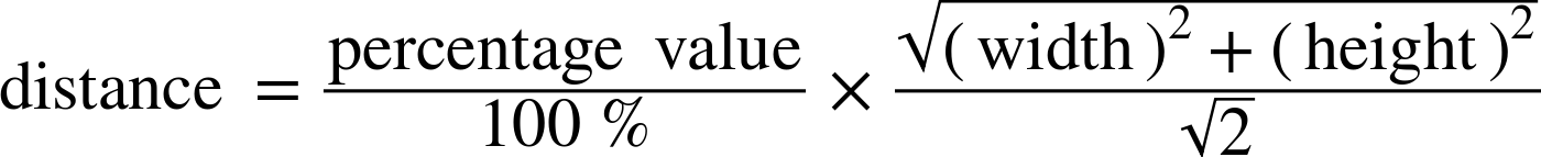
That √2 factor means that the numbers aren’t usually nice neat integers anymore, but the same formula works in any SVG, of any dimensions.
If your SVG was 12cm wide and 5cm tall, the full diagonal would be √(122 + 52)cm, or 13cm. A 100% diagonal distance would be approximately (13cm / 1.41), or 9.19cm.
The main thing you need to know, is that a percentage length for circle radius is somewhere in-between the lengths that you would get for that percentage for width and that percentage for height.
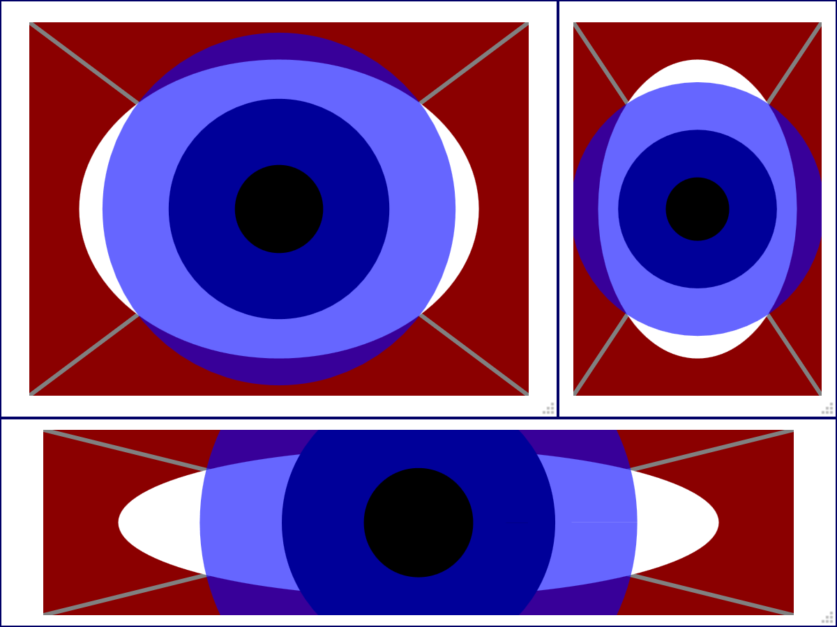
There is one interesting side effect of the formula, that relates to the geometry of ellipses: when a circle and an ellipse both use the same percentage values for their radius, the radius will be the same on the diagonal of an ellipse. That relationship is demonstrated in Example 25-1.
The code uses HTML and CSS to create a resizable container for an inline <svg>, allowing you to test the same percentages in different-sized graphics. Figure 25-2 shows the result when the graphic has been resized to various aspect ratios.
Example 25-1. Sizing circles and ellipses using percentages, in a resizeable SVG
<!DOCTYPE html><htmllang="en"><head><title>Keeping an Eye on Percentage Sizing</title><style>html,body{height:100%;margin:0;}.wrapper{position:relative;border:thinsolid;box-sizing:border-box;height:100%;}@supports(resize:both){.wrapper{height:10em;width:20em;resize:both;overflow:hidden;}}svg{display:block;position:absolute;height:90%;width:90%;top:5%;left:5%;background:darkRed;}</style></head><body><divclass="wrapper"><svg><gstroke="gray"stroke-width="3px"><linex2="100%"y2="100%"/><linex1="100%"y2="100%"/></g><ellipsecx="50%"cy="50%"ry="40%"rx="40%"fill="white"/><circlecx="50%"cy="50%"r="25%"stroke="blue"stroke-width="30%"stroke-opacity="0.6"/></svg></div></body></html>

-
The HTML style block defines the properties that allow the user to resize the SVG. A wrapper element, with a defined width and height, and a non-default
positionproperty, is given theresize: bothproperty to allow resizing in horizontal and vertical directions. Theoverflowproperty must be changed from the default (visible) to make this work. Since CSSresizeis not supported in all browsers, an@supportsrule is used to set these values; in other browsers, the graphic fills the entire screen, and you can resize the browser window. 
-
The SVG is positioned absolutely within it’s wrapper, stretched to fit the current wrapper size, with a 5% offset from the edges.

-
The SVG box is given a solid, dark red background color which will provide contrast for the graphic.

-
The SVG code is contained in an inline
<svg>element. Because this is HTML 5, the SVG namespace can be omitted from the markup. 
-
Diagonal guidelines are drawn between each corner of the SVG.

-
The white ellipse is centered in the SVG region, with horizontal and vertical radius of 40%.

-
The circle is centered on the same point. Both the radius and the stroke-width are set using percentages; the stroke is partially transparent so that you can see the edges of the shapes underneath it.
The wide stroke is controlled by setting stroke-width to a percentage value. It will also scale in proportion to the diagonal of the SVG region.
The combined distance of the circle’s r value (25%) and the outside half of the stroke-width (half of 30%, or 15%) means that the outer edge of the circle’s stroke creates an effective radius of 40%. On the diagonals, this always exactly matches the edge of the white ellipse which has both horizontal and vertical radii of 40%. This can be confirmed by the guidelines drawn in Figure 25-2, or by opening the web page in a browser and resizing it yourself.
Warning
The CSS resize property used in the example is introduced in the CSS 3 Basic User Interface module. It has not been implemented in Internet Explorer or MS Edge as of EdgeHTML version 16, and is also not supported in many mobile browsers. If resizability is a fundamental part of your website, use JavaScript event handling.
As you can discover when testing Example 25-1 in your browser, the circle sized with percentage values can easily extend outside the bounds of the SVG if the SVG is wide and short or tall and narrow. With percentage sizing alone, there is no way to limit the circle to fit within the more constrained dimension.
Tip
To create a scalable shape that still always fits within the SVG, you need to create the scaling effect with viewBox, which we discuss in Chapter 8.
You rarely need to know the specifics of how diagonal percentages work in SVG. However, it’s good to know that they work in a complicated way, so you’re not expecting them to be simple!