Dynamically Changing preserveAspectRatio
In Example 8-2 and the following sections in the book, we built a resizable inline SVG, for testing the effect of viewBox and preserveAspectRatio values in viewports of different sizes and aspect ratios.
Example 8-X1, goes one step further, creating a dynamic web page in which you can switch between the options using form inputs.
Example 8-X1. Dynamic demonstration of preserveAspectRatio options
HTML markup:
<!DOCTYPE html><htmllang="en"><head><metacharset="utf-8"/><title>preserveAspectRatio options</title><linkrel="stylesheet"href="flex-scale-viewBox.css"/><style>/* additional styles for form */form{max-width:25em;text-align:right;}label{display:block;margin:0.2em0;}</style><scriptsrc="flex-scale-preserve-options.js"></script></head><body><formid="preserve-options"><label><code>preserveAspectRatio</code>mode<selectid="preserve"><optionvalue="none">none</option><optionvalue="meet"selected>meet</option><optionvalue="slice">slice</option></select></label><label><i>x</i>-alignment<selectid="x-align"><optionvalue="xMin">min</option><optionvalue="xMid"selected>mid</option><optionvalue="xMax">max</option></select></label><label><i>y</i>-alignment<selectid="y-align"><optionvalue="YMin">min</option><optionvalue="YMid"selected>mid</option><optionvalue="YMax">max</option></select></label></form><divclass="wrapper"><svgid="preserve-svg"viewBox="0,0 20,20"><title>Spade</title><pathd="M9,15C9,20 0,21 0,16S6,9 10,0C14,9 20,11 20,16 S11,20 11,15Q11,20 13,20H7Q9,20 9,15Z"/></svg></div></body></html>

-
The stylesheet from Example 8-2 is re-used, to create the resizable SVG. That could include any modifications you added to make the SVG resizable without the CSS
resizeproperty. 
-
A linked script will add the behavior to listen for user input and update the SVG accordingly.

-
The webpage includes a
<form>with the three drop-down lists for each of the three independent parts of thepreserveAspectRatioattribute. The lists are created using the HTML<select>and<option>elements. A<label>wrapped around each selection set associates the description with the form field. 
-
The
meetoption is selected by default, to match the defaultpreserveAspectRatiovalue on the SVG. 
-
For the x- and y-alignment options, the
valueattribute for each<option>is the exact keyword that will be used in the finalpreserveAspectRatiovalue (including capitalization), but the visible text is more readable. Again, the defaultxMidYMidoptions are checked.
JavaScript: flex-scale-preserve-options.js
window.addEventListener("load",function(){vardoc=document;varsvg=doc.getElementById("preserve-svg");varpreserve=doc.getElementById("preserve");varxAlign=doc.getElementById("x-align");varyAlign=doc.getElementById("y-align");doc.getElementById("preserve-options").addEventListener("change",update);functionupdate(event){varp,string;p=preserve.value;if(p=="none"){xAlign.disabled=yAlign.disabled=true;string=p;}else{xAlign.disabled=yAlign.disabled=false;string=xAlign.value+yAlign.value+" "+p;}svg.setAttribute("preserveAspectRatio",string);}update();});
-
As usual, the script is contained inside an anonymous function. However, instead of running the function automatically, it is set to run when the document finishes loading (and the
loadevent is triggered on the window). The script can therefore be included in the HTML<head>, instead of at the end, and it will still not run until all the elements had been initialized. -
All the key elements in the markup have
idattributes, so they are easy to access from the script. They won’t change, so they are selected once and stored in variables. Thedocvariable is just a convenient alias fordocument, to reduce typing. -
A single listener function will react to all changes within the form, regardless of which input element triggered the change. We don’t need to access the form again, so it isn’t saved to a variable; instead, the
addEventListenermethod is called directly on the object returned bygetElementById. -
The
update(event)function determines the currently selected options in the form, and sets the SVG’spreserveAspectRatioaccordingly. Thevalueproperty of anHTMLSelectElementis equal to thevalueattribute of the currently selected<option>. -
If the selected mode is
none, the alignment options are disabled. These only have an effect formeetandslice. 
-
For options other than
none, the current alignment selections are accessed, and all three keywords are composed into a singlepreserveAspectRatiostring (paying attention to the spacing between values). 
-
The update function is also called once when the script is run after loading. That way, the SVG matches the form selections if the browser remembers choices from a previous visit to the web page.
The web page, with the SVG set to xMinYMax slice is displayed in Figure 8-X1. To get the complete effect, view the live example in your browser. Try out all the options, and resize the SVG for each.
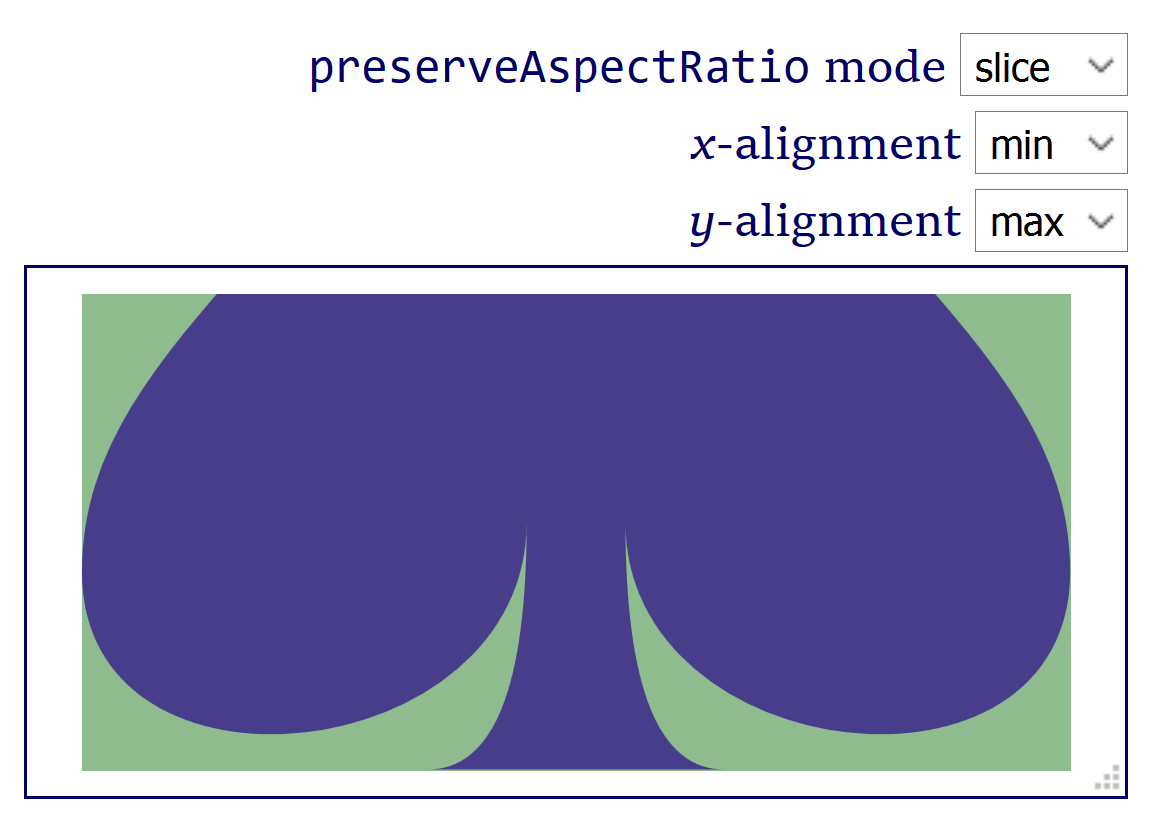
As you experiment, it should become clear that only one of the alignment options has an effect at a time. The graphic always exactly fits one dimension of the available space. Whether its the x or y dimension is determined both by the shape of the space, and by meet versus slice.
In Chapter 10, we look at preserveAspectRatio again, for images. We can, of course, adapt the form and script from Example 8-X1 to instead set the attribute on the <image> element. Example 8-X2 does that, using the multi-image layout from Example 10-4.
Example 8-X2. Demonstrating preserveAspectRatio options on embedded images, dynamically
<!DOCTYPE html><htmllang="en"><head><metacharset="utf-8"/><title>preserveAspectRatio for Images</title><style>body{margin:0;}form{max-width:400px;text-align:right;}label{display:block;margin:0.2em0;}svg{display:block;max-height:calc(100vh-5em);max-width:100%;}</style></head><body><formid="preserve-options"><label><code>preserveAspectRatio</code>mode<selectid="preserve"><optionvalue="none">none</option><optionvalue="meet"selected>meet</option><optionvalue="slice">slice</option></select></label><label><i>x</i>-alignment<selectid="x-align"><optionvalue="xMin">min</option><optionvalue="xMid"selected>mid</option><optionvalue="xMax">max</option></select></label><label><i>y</i>-alignment<selectid="y-align"><optionvalue="YMin">min</option><optionvalue="YMid"selected>mid</option><optionvalue="YMax">max</option></select></label></form><svgxmlns="http://www.w3.org/2000/svg"xml:lang="en"xmlns:xlink="http://www.w3.org/1999/xlink"width="400"height="600"viewBox="0 0 400 600"><style>text{font:20pxTahoma,sans-serif;text-anchor:middle;fill:darkRed;}.bird-colorsrect{fill:#5f6cb9;}.bird-colorstext{fill:#bbde60;}.theme-colorsrect{fill:#00aaa9;}.theme-colorstext{fill:white;}</style><svgviewBox="50 5 500 750"width="50%"height="50%"><imageheight="900"width="600"class="preserve-image"aria-label="Using SVG cover image"xlink:href="using_svg_cover.png"/></svg><gclass="bird-colors"><rectx="50%"height="50%"width="50%"/><textx="75%"y="45"dy="-0.5em">Amelia<tspanx="75%"dy="1em">Bellamy-Royds</tspan></text><imagex="50%"y="80"height="220"width="200"class="preserve-image"aria-label="Amelia in the sunshine"xlink:href="Amelia.jpg"/></g><gclass="bird-colors"><recty="50%"height="50%"width="50%"/><textx="25%"y="345">Kurt Cagle</text><imagey="380"height="220"width="200"class="preserve-image"aria-label="Kurt in a top hat"xlink:href="Kurt.jpg"/></g><gclass="theme-colors"><rectx="50%"y="50%"height="50%"width="50%"/><textx="75%"y="345">Dudley Storey</text><imagex="50%"y="380"height="220"width="200"class="preserve-image"aria-label="Dudley, re-imagined as a tiny warrior"xlink:href="Dudley.jpg"/></g></svg><script>window.addEventListener("load",function(){vardoc=document;varimages=doc.getElementsByClassName("preserve-image");varpreserve=doc.getElementById("preserve");varxAlign=doc.getElementById("x-align");varyAlign=doc.getElementById("y-align");doc.getElementById("preserve-options").addEventListener("change",update);functionupdate(event){varp,string;p=preserve.value;if(p=="none"){xAlign.disabled=yAlign.disabled=true;string=p;}else{xAlign.disabled=yAlign.disabled=false;string=xAlign.value+yAlign.value+" "+p;}for(vari=0,n=images.length;i<n;i++){images[i].setAttribute("preserveAspectRatio",string);}}update();});</script></body></html>
-
The form hasn’t changed from Example 8-X1; since the embedded images are not SVG, the
deferoption is not relevant forpreserveAspectRatio. -
The main SVG has a fixed height and width in the markup, but CSS
max-heightandmax-widthwill scale it down to fit the screen. -
Each image is identified by the class
preserve-imageto allow it to be selected in the script. (However, the book-cover image exactly matches its aspect ratio, and won’t ever change.) -
All three photographs are given the same dimensions, in the SVG’s coordinate system: 200px wide and 220px tall.
-
Because we are modifying multiple elements, the script has been changed to cycle through them in a loop; otherwise, it is the same as Example 8-X1.