Picking the Perfect View
In a complex web design, you may wish to change the view of your SVG to fit the screen. For example, your full SVG may look best in landscape orientation. On a mobile device in portrait mode, you might want to switch to a cropped version of the graphic that zooms in on the important parts.
We can’t currently adjust the crop with CSS media queries inside the SVG file, since CSS can’t control viewBox. But an SVG view can.
Both pre-defined <view> elements inside your SVG file and custom #svgView() fragments can change the root viewBox of the SVG file. But in order to activate a view, you must include the correct target fragment in the URL that embeds the SVG file.
So, what we need is a way to change the URL of an embedded SVG when the screen is in portrait mode instead of landscape.
The HTML <picture> element can do that.
The media attribute for <source> elements within a <picture> was originally intended to allow you to switch to a completely different (raster) image file for different media queries. But it also works with SVG views.
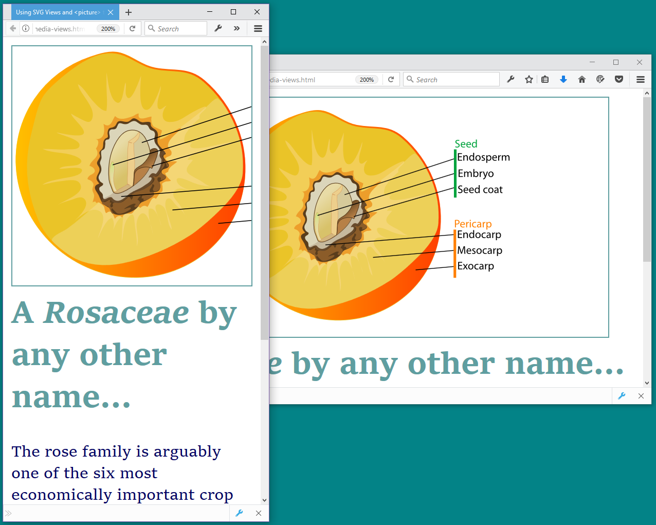
Example 9-X1 uses <picture> and SVG views to crop a large header image. The graphic (a diagram of a peach by contributor LadyofHats) is taken directly from Wikimedia Commons. Instead of editing the file to add a <view>, the crop is defined from the HTML file, with the SVG view fragment syntax.
Figure 9-X1 shows the resulting page, in browser windows of different dimensions.
Example 9-X1. Using views and nested SVGs to arrange multiple icons in a single file
<!DOCTYPE html><htmllang="en"><head><metacharset="utf-8"/><title>Using SVG Views and<picture>to crop for different layouts</title><style>header{color:cadetBlue;}headerh1{margin-top:0.2em;}headerimg{border:solidthin;display:block;margin:auto;width:86vw;height:64vw;max-height:80vh;}@media(orientation:portrait){headerimg{width:90vw;height:90vw;}}</style></head><body><header><picture><sourcetype="image/svg+xml"srcset="Drupe_fruit_diagram-en.svg#svgView(viewBox(20,10,300,300))"media="(orientation: portrait)"/><imgsrc="Drupe_fruit_diagram-en.svg"type="image/svg+xml"alt="Botanical diagram of a peach."/></picture><h1>A<ilang="la">Rosaceae</i>by any other name…</h1></header><p>The rose family is arguably one of the six most economically important crop plant families, and includes apples, pears, quinces, medlars, loquats, almonds, peaches, apricots, plums, cherries, strawberries, raspberries, sloes, and roses among the crop plants belonging to the family.</p><small>Text adapted from<ahref="https://en.wikipedia.org/wiki/Rosaceae">Wikipedia</a></small></body></html>

-
The basic dimensions of the header image are defined with CSS
vwviewport units, to fill up most of the screen width, while still preserving the 4:3 aspect ratio of the original SVG. Amax-heightsetting limits the image size on very wide and short screens, to leave some room for the header text. 
-
On portrait screens, the media query kicks in, making the image square. The
orientationmedia query only has two options (portraitandlandscape), but you could use theaspect-ratiomedia query if you needed more control. 
-
Within the markup, the same media query is used in the
mediaattribute of a<source>element. Thesrcsetattribute for that source includes the SVG view URL for the square-cropped version of the graphic. As we mentioned in Chapter 2 when we introduced<picture>for SVG fallback, you have to usesrcsetwith a picture<source>, notsrc, even when you only have one source value. 
-
The
<img>element within the<picture>has the basic URL for the SVG, which will be used if the media query doesn’t apply. Alternatively, you could use two different SVG<source>elements, and have a raster fallback (e.g., PNG) in the<img>.
View the live example in your browser.
If views aren’t supported—or if <picture> isn’t supported—you would get the regular view of the SVG, scaled according to the default viewBox to fit the height and width of the <img>. The width and height, however, would still be adjusted by the media query in the main page’s CSS. The result won’t be perfect, but it will still be functional.
Warning
As we warn a few times in the book, Safari/WebKit only applies SVG views on HTTPS pages, for same-origin SVG embeds.
The view only crops the image, it doesn’t edit it. Which means that even though we’ve cropped out the labels in the portrait version of Figure 9-X1, the lines connecting those labels to the graphic are still visible.
If you did want to edit the SVG file to add a <view>, you could also add :target rules to hide extraneous content. Because the actual target is the <view> element, you’d need to place the <view> near the top of the file, and then use CSS sibling selectors to select the graphics.
For example, we could edit the SVG to add a <view> with an id of cropped, like this:
<viewid="cropped"viewBox="20,10,300,300"/>
We would put that <view> near the top of the file (e.g., right after the <title>), and then group all the drawing code together with a <g> element that is a sibling to the <view>.
Then we would give the elements that we want to remove a shared class (e.g., hide-when-cropped), and add a <style> block to our SVG file, with a CSS rule like this:
#cropped:target~g.hide-when-cropped{display:none;}
Finally, the <picture> element in our main web page would be updated to use the id of the <view> instead of the #svgView() fragment:
<picture><sourcetype="image/svg+xml"srcset="Drupe_fruit_diagram-en-2.svg#cropped"media="(orientation: portrait)"/><imgsrc="Drupe_fruit_diagram-en-2.svg"type="image/svg+xml"alt="Botanical diagram of a peach."/></picture>
Now, when the web browser switches to portrait mode, not only will the SVG be cropped to only show the diagram, but the labels and their lines will disappear, too.
View the modified example in your browser.
Warning
Older versions of Firefox (prior to 39) did not apply the :target pseudoclass for <view> element targets. So you’d get the same result as Figure 9-X1.
However, whether the labels are visible or not, remember that text inside an <img> is not accessible. And, unfortunately, there is no equivalent to <picture> for embedded objects; you’d need to use JavaScript to swap the view of an SVG embedded with <object> or <iframe>. JavaScript is also currently needed to update views of inline SVG (by directly changing the viewBox attribute).
Note
If you look at the source code for the SVG file we’re using, you’ll discover that the inaccessible text doesn’t actually change anything—the text in the labels has already been converted to inaccessible paths!
Remember to check for text-that-isn’t-text when using diagrams from Wikipedia or other clip-art sources.
You should also be able to use views for SVG used as CSS background images. A media query in your CSS can change the background-image property to use the URL with the SVG view fragment. However, as we’ve warned a few times in the book, WebKit and older Blink browsers do not support URL target fragments for images in CSS. Those browsers would show the regular view of the SVG, scaled to fit the image dimensions.