objectBoundingBox versus userSpaceOnUse
We introduced the idea of bounding-box versus user-space units in Chapter 12 in the book. But the concepts are worth a deeper look. Not only are these options used in gradients and patterns, but also in filters, masks, and clipping paths.
This article is a two-parter: first, we look a little more closely at the differences between objectBoundingBox and userSpaceOnUse, with a particular focus on transformed or re-used elements. Then, we take a closer look at the bounding boxes of text elements. We end with a few notes on bounding boxes of grouping elements, which will become important in later chapters.
Bounding Boxes and Transformations#
There are pros and cons to both options. Which you should use depends on what you’re trying to do. Bounding box effects are often easiest to control for a single shape, but user space effects allow better coordination with the overall layout of your graphic. User-space effects also avoid the distorting effect of a non-uniform bounding box scale.
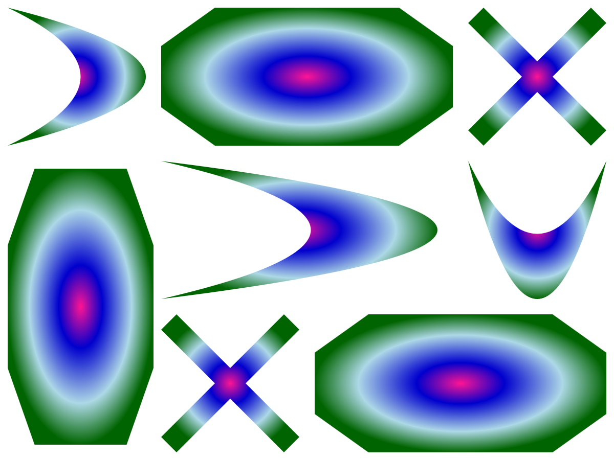
Example 12-X1 uses a radial gradient to show what objectBoundingBox (the default for gradients) looks like in practice, when applied to many different shapes in a drawing. The gradient transitions from deep pink in the middle to medium blue, then light blue, and finally dark green at the edges. The shapes are different sizes and different aspect ratios—some have square bounding boxes, some rectangular—and some of them are positioned directly, some with transforms, and some with <use> elements.
Figure 12-X1 shows the result.
The three shapes across the top of the figure, and the one in the middle, are drawn exactly where they are defined in the coordinate system. The others have transformations or <use> repositioning.
Example 12-X1. Filling shapes with a gradient sized to the object bounding box
<svgxmlns="http://www.w3.org/2000/svg"xml:lang="en"xmlns:xlink="http://www.w3.org/1999/xlink"width="400px"height="300px"viewBox="0 0 400 300"><title>objectBoundingBox Gradient Units</title><radialGradientid="gradient"><stopstop-color="deepPink"offset="0"/><stopstop-color="mediumBlue"offset="0.3"/><stopstop-color="lightBlue"offset="0.7"/><stopstop-color="darkGreen"offset="1"/></radialGradient><gfill="url(#gradient)"><pathid="swoosh"d="M5,5 Q 185,50 5,95 Q 100,50 5,5 Z"/><pathid="swoosh2"d="M105,105 Q 465,150 105,195 Q 300,150 105,105 Z"/><usexlink:href="#swoosh"transform="translate(400,100) rotate(90)"/><pathid="plaque"d="M105,30 l 35 -25 h 120 l 35 25 v 40 l -35 25 h -120 l -35 -25 z"/><usexlink:href="#plaque"transform="translate(100, 200)"/><pathid="plaque2"d="M10,80 l 35 -25 h 120 l 35 25 v 40 l -35 25 h -120 l -35 -25 z"transform="scale(0.5,2)"/><pathid="cross"d="M305,5 m10,0 l35,35 l35,-35 l10,10 l-35,35 l35,35 l-10,10 l-35,-35 l-35,35 l-10,-10 l35,-35 l-35,-35 z"/><usexlink:href="#cross"x="-200"y="+200"/></g></svg>

The gradient is given the (easy-to-remember)
idvaluegradient. No other attributes are set, so its geometry will be based on the defaults for<radialGradient>elements: a circle centered in the bounding-box, then scaled/stretched to fit that box.
The four color
<stop>elements are arranged from center to edge of the gradient.
The gradient is assigned to the shapes using a
fillpresentation attribute on a<g>element. Thefillproperty has no direct effect on a<g>, but it will inherit to the shapes and<use>elements inside the group.
The
swooshpath is made of two quadratic curves that create a 90×90 bounding box in the upper left of the drawing. Theswoosh2path has a similar shape, but twice as wide, and is positioned in the middle of the drawing. The final swoosh is a<use>copy of the first, translated into place at the bottom of the drawing, then rotated 90°. All three shapes have control points that extend well outside their bounding box, so if your browser is using the “fast” bounding-box calculation, you’ll see a much more stretched-out gradient than the version in Figure 12-X1.
The
plaquepath has a 190×90 bounding box, and is positioned centered along the top of the drawing. A copy is positioned along the bottom of the drawing with atransformon a<use>element. An independently-definedplaque2has the same relative path commands—and therefore the same 190×90 bounding box dimensions—but redrawn on the left side of the drawing. It is then compressed horizontally and stretched vertically with a scaletransform.
The
crosspath is initially defined on the top right of the drawing, then copied and re-positioned with a<use>element withxandyattributes. It has a 90×90 square bounding box.
The gradient, using the <radialGradient> element, is defined by a circle that is centered in the bounding box and stretches to its edges. The first stop (pink) is at the center, and the last stop (dark green) is at the edge. The center is the center of the bounding box, which doesn’t always match the “visual center” of the largest fill region.
SVG radial gradients are always circles, but they don’t always look that way. When the shape’s bounding box isn’t a square, the circular gradient gets stretched into an ellipse by the non-uniform scaling. Sometimes this is what you want, sometimes it isn’t.
Tip
In Chapter 13 we’ll discuss additional complications of objectBoundingBox when applied to strokes. The bounding box is still calculated from the fill region, not the stroke region, and that can cause problems.
For this particular gradient, the transformations and <use> elements don’t have any visible effect. For a different gradient or pattern, you would see that the gradient is transformed along with the shape that contains it, rotated or skewed accordingly.
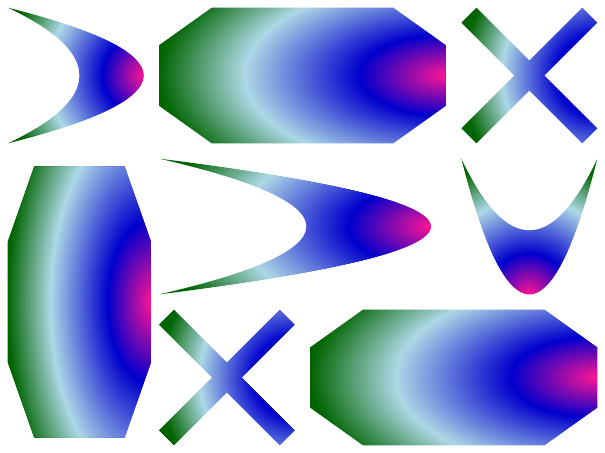
For example, Figure 12-X2 shows the same shapes when the gradient is changed to be off-center—with the midpoint of the gradient positioned on the middle of the right side of the bounding box—by adding cx, cy, and r attributes:
<radialGradientid="gradient"cx="1"cy="0.5"r="1">
The rotated “swoosh” shape is visible as the odd one out, with the pink center of the gradient rotated along with the outline.
Transformations—both rotations and translations—also become very visible if you switch to user-space scaling.
To switch scaling methods, you only need one change to the code in Example 12-X1. Add a new gradientUnits attribute on the original gradient element (from Example 12-X1), and set it to userSpaceOnUse, like this:
<radialGradientid="gradient"gradientUnits="userSpaceOnUse">
Figure 12-X3 shows the result after the change.
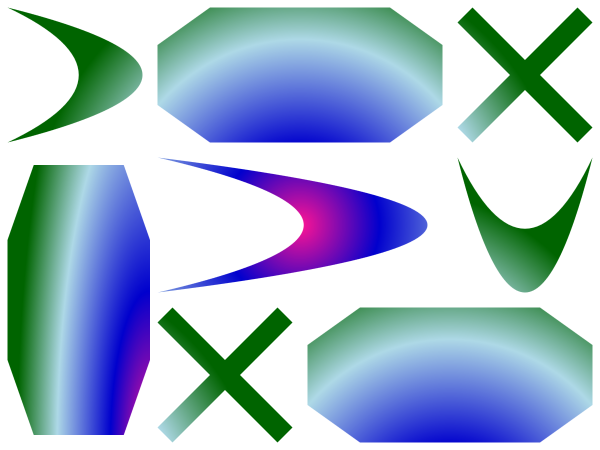
With the user-space gradient, the gradients of different shapes share the same coordinate system. When the shapes are actually drawn at the coordinates they are defined, this means that the gradient continues smoothly from one shape to the next. The center of the gradient is the center of the drawing, and the color stops create circles around it, which evenly arc across the original shapes in the top row.
The exceptions to the continuity are the transformed shapes and <use> elements. These are drawn with the coloring they would have at that shape’s original position and scale, not the final position.
Another important difference: the overal radial gradient shape remains circular, despite the fact that the overall SVG coordinate system is rectangular, not square. The elliptical shape in the objectBoundingBox gradient was caused entirely by the non-uniform scale transform: with userSpaceOnUse, there is no scaling. Again, there is an exception: a non-uniform scaling transformations on a shape itself (the plaque on the left of Figure 12-X3) also distorts the gradient it is drawn with.
What if you want a real, circular gradient, but sized and positioned to match a bounding box? Well, you could create a separate userSpaceOnUse gradient for each element. And transform the gradients every time you transform the elements. But that sounds like a lot of code.
An alternative solution is to use the viewBox attribute on a <pattern> element to preserve the aspect ratio of the gradient. The pattern would be a single tile, similar to the photo-fill effect we created in Example 12-9 in the book. It’s content is a square <rect> filled with the radial gradient. A second <rect>, underneath, pads all sides of the tile, beyond the viewBox, with a solid backdrop color:
<patternid="pattern-gradient"width="1"height="1"viewBox="0 0 1 1"><rectx="-10"y="-10"width="21"height="21"fill="darkGreen"/><rectwidth="1"height="1"fill="url(#gradient)"/></pattern>
When that <pattern> is added to the code from Example 12-X1, and the shapes are changed to use fill="url(#pattern-gradient)", the result is as shown in Figure 12-X4.
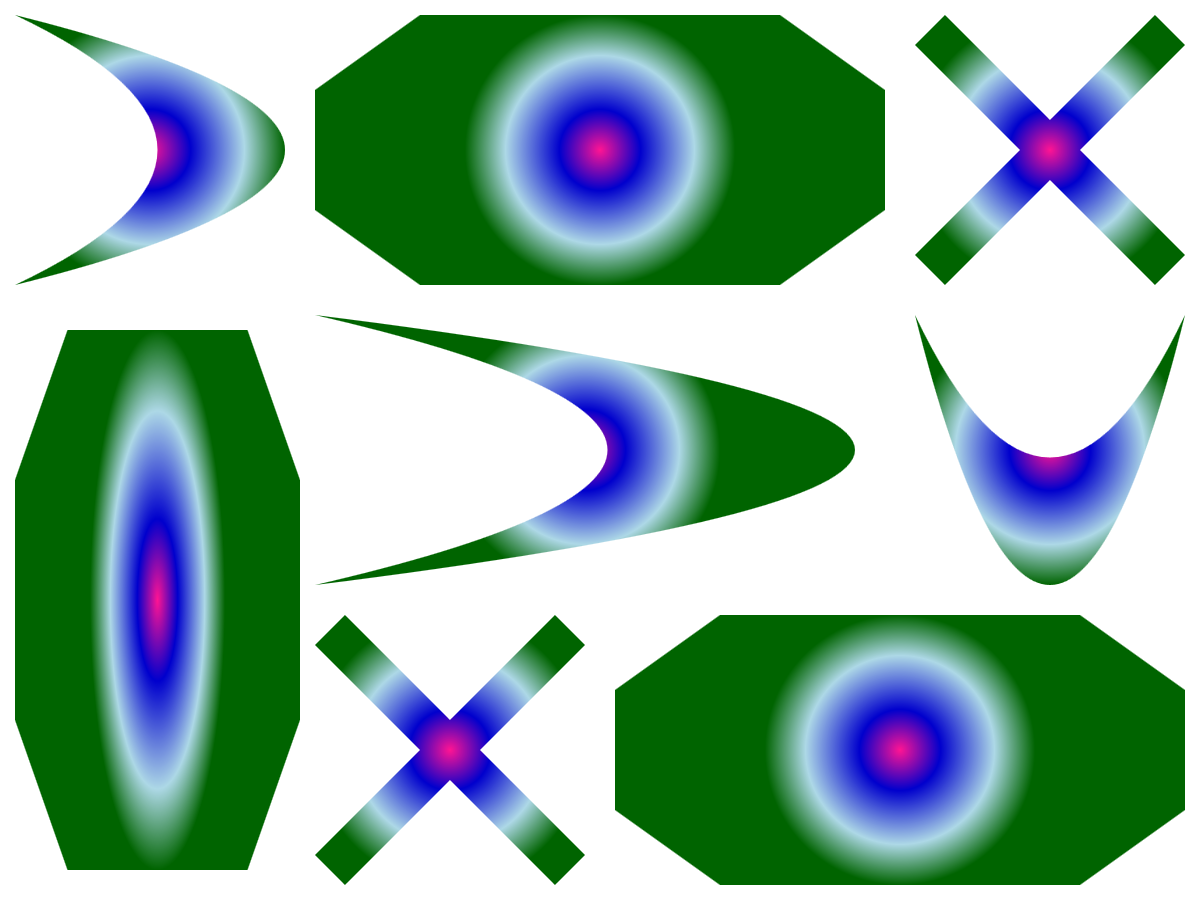
Just like with the userSpaceOnUse gradient, the shape with a non-uniform scale transform has a distorted fill to match. For the other shapes, however, the gradient stays centered and circular.
Tip
If the bounding box of a shape was very thin or very tall, the backdrop <rect> might need to be larger to be sure it covers the entire shape when the viewBox is scaled down to fit the smaller dimension.
You could of course add a preserveAspectRatio option to the <pattern> element if you wanted your circular gradient to align differently within rectangular bounding boxes. With a slice mode, the gradient would scale to completely cover the bounding box—and you wouldn’t need the backdrop rectangle any more.
Stretching Paint To Fit Text#
Think you’ve got a handle on bounding boxes now? It gets a little more complicated when you switch from painting shapes to painting text.
For userSpaceOnUse, <text> elements don’t do anything special. But objectBoundingBox is another matter.
The bounding boxes of text elements in SVG are calculated differently than for shapes. For starters, they are based on the character layout boxes, not the actual paths used for each character. That means the overall bounding box should be calculated as if each character filled up a perfect rectangle that is 1em tall.
To examine text bounding boxes, consider the following two <text> elements, one containing a <textPath>, the other just a single line of plain text.
<text><textPathxlink:href="#p">The Bounding Box</textPath></text><textx="380"y="200"text-anchor="end">…of Text!</text>
To highlight some complications, we’ll use a decorative cursive font with big swoopy letters.
Figure 12-X5 shows how the bounding box should be calculated, according to the SVG specs. Each character in the layout has a layout rectangle (blue fill). The bounding box (dashed outline) is the box that contains all those rectangles.
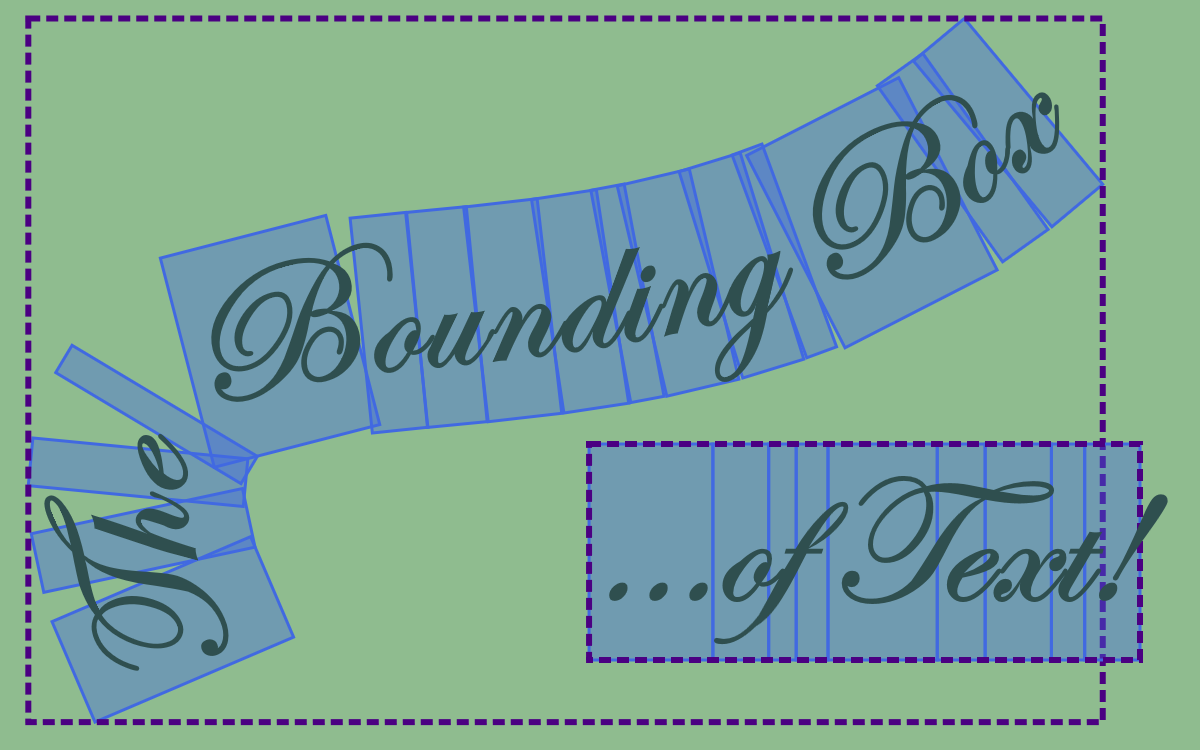
However, in practice every browser calculates the text bounding box slightly differently, either including glyphs that extend outside the layout box (like the final exclamation mark in Figure 12-X5), or including extra whitespace or line-height spacing, or some combination of any of the above.
Figure 12-X6 shows the bounding boxes for the same text, as calculated by two different browsers.
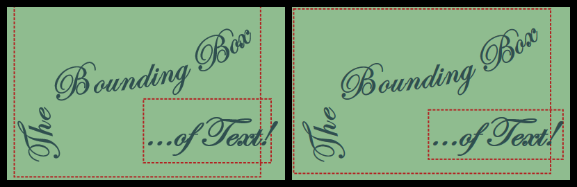
In other words, when painting text—or using any other effect or calculation based on the bounding box—assume a little bit of variation from browser to browser. Don’t rely on details being precisely positioned at the edges of the text.
The other unique feature of painting text is that the bounding box is always the bounding box of the entire <text> element—even if only a <tspan> is being filled.
Example 12-X2 uses linear gradients to show the effect. There are two gradients: a left-to-right, gold-to-pink gradient on the <text> elements, and a top-to-bottom, blue-to-white gradient on alternating <tspan> elements. Figure 12-X7 shows the result.
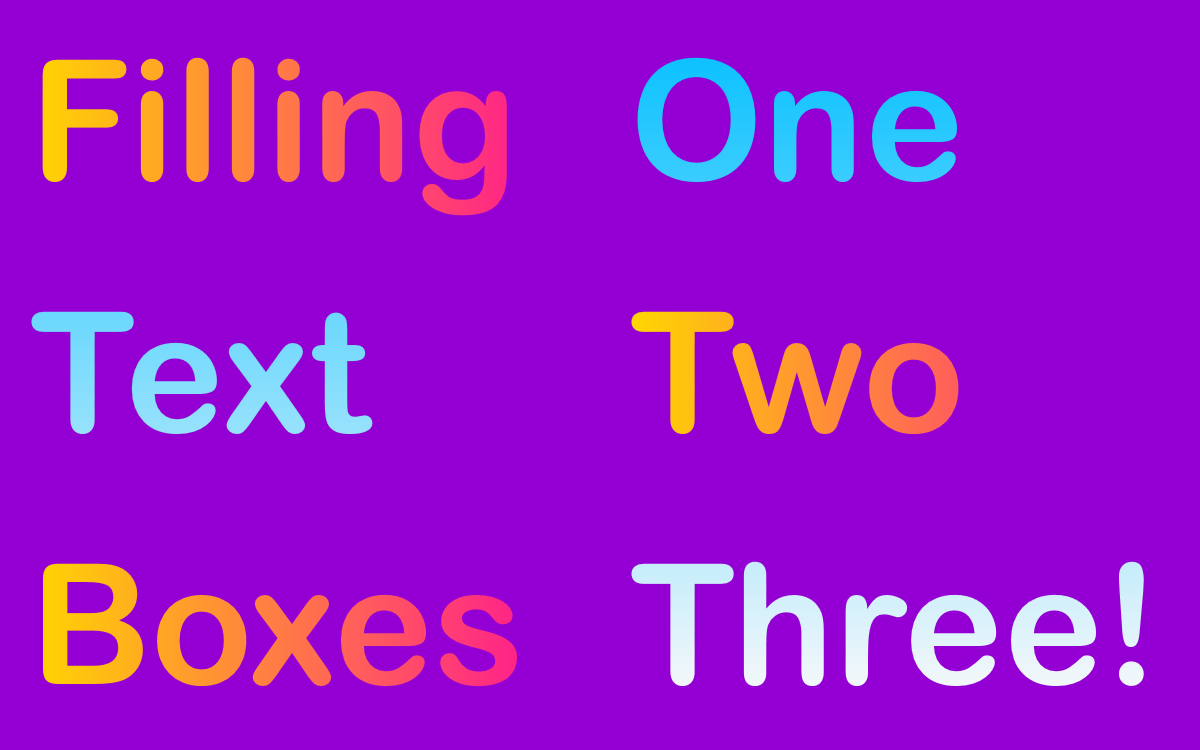
<tspan> elements filled with linear gradientsExample 12-X2. Filling text with object bounding-box gradients
<svgxmlns="http://www.w3.org/2000/svg"xml:lang="en"xmlns:xlink="http://www.w3.org/1999/xlink"width="400px"height="250px"viewBox="0 0 400 250"><title>Text with Linear Gradients</title><linearGradientid="horizontal"><stopstop-color="gold"offset="0"/><stopstop-color="deepPink"offset="1"/></linearGradient><linearGradientid="vertical"x2="0"y2="1"><stopstop-color="deepSkyBlue"offset="0"/><stopstop-color="snow"offset="1"/></linearGradient><style>text{font:bold56pxArialRoundedMT,DejaVuSans,sans-serif;fill:url(#horizontal);}tspan.em{fill:url(#vertical);}</style><rectwidth="100%"height="100%"fill="darkViolet"/><textx="10"y="60px">Filling<tspanclass="highlight"x="10"dy="1.5em">Text</tspan><tspanx="10"dy="1.5em">Boxes</tspan></text><textx="210"y="60px"><tspanclass="highlight">One</tspan><tspanx="210"dy="1.5em">Two</tspan><tspanclass="highlight"x="210"dy="1.5em">Three!</tspan></text></svg>
As with the radial gradients,
<linearGradient>elements default toobjectBoundingBoxsizing. They are also by default horizontal. Thex2andy2attributes convert the second gradient to vertical orientation. The differentstop-colorvalues allow you to tell the two gradients apart.The
verticalgradient is applied to the<tspan>elements with thehighlightclass.Each word in the text is positioned to a new line with a
<tspan>withxanddyattributes. Only every second<tspan>element gets thehighlightclass.The second column of words is a separate
<text>element.
The horizontal gradient starts over for the second <text> element on the right, but the vertical gradients on the three distinct <tspan> elements appear to be continuous—even though they are still objectBoundingBox gradients—because they are all scaled for the same three-line height of the entire <text> elements.
Warning
Blink and WebKit browsers apply paint to rotated text characters (from the rotate attribute or from <textPath> positioning) before rotation, instead of after. This causes gradients and patterns to be disjointed instead of continuous from one letter to the next.
Because text elements use different bounding boxes than paths do, converting text to paths can cause gradients to change shape. You can reduce the impact by merging the paths for each letter into a single multi-part path (depending on the software you use, it might do this already), but it will never be exactly the same.
Group Bounding Boxes#
There’s one final confusion to warn about when talking bounding boxes: the bounding boxes of grouping elements like <g> and <svg> (and <use> copies of groups or symbols).
These bounding boxes don’t have an effect for gradients and patterns, because paint servers don’t apply to grouping elements, they inherit down to the individual shapes or text. But for filters and masking, the effect applies to a group as a whole, and a composite bounding box is calculated from all the child elements.
Any child elements with transformations are measured in their parent coordinate system when calculating the composite box. Hidden overflow does not have an effect: the full dimensions of the shapes are still used, even if they are hidden.
We discuss bounding boxes on grouping elements briefly in later chapters, when it changes the outcome of the effects we use.