Faking Repeating Gradients
In the book we had multiple examples of using the spreadMethod attribute to create repeating and reflecting gradients, but with a warning: WebKit does not (yet) support them. All SVG gradients get the pad behavior in Safari and iOS browsers. So if you’re building SVG for the web, you’ll often need another approach.
But what happens if your already have an SVG that works in other browsers? How do you create the same effect in a cross-browser way?
For radial gradients, the only solution is to repeat the <stop> elements in your gradient as many times as are necessary to fill up the shape. As we warned in the book, for off-center radial gradients (which use the fx and fy to distort the radial pattern), you’ll never exactly recreate the original effect.
For linear gradients, however, there is another option: the <pattern> element.
The contents in a <pattern> can include shapes filled with gradients. Which means that the repeating columns (or rows) of pattern tiles can be used to replicate the repeats in a repeating linear gradient. Unlike real repeating SVG gradients, this version works on WebKit.
Turning a repeating gradient into a repeating pattern is fairly straightforward if the gradient is exactly horizontal or vertical. However, it gets a little more complicated if the gradient was on an angle. You’ll need to use some trigonometry to figure out the dimensions of your repeated sections, and then the patternTransform attribute to recreate the angle.
The process of converting a repeating linear gradient to a pattern is as follows:
-
Create a
<pattern>that uses the same type of scaling units as the gradient, for both the pattern tile and the pattern contents. If the gradient hadgradientUnits="userSpaceOnUse", then setpatternUnitsto match. If the gradient usedobjectBoundingBox(either explicitly or by default), then setpatternContentUnitsto match. -
Give the
<pattern>theidthat you were using for the repeating linear gradient—that way, you don’t have to change any of your styles. Give the<linearGradient>a newidthat helps remind you of its relationship to the<pattern>. For example:<linearGradientid="green-repeating-gradient-unit">...</linearGradient><patternid="green-repeating-gradient">...</pattern> -
Set the
xandyattributes on the<pattern>to the values ofx1andy1from the<linearGradient>. (If there aren’tx1andy1attributes, then you don’t needxandyattributes: the defaults are the same.) -
Convert all geometric attributes (
x1,y1,x2, andy2) on the gradient to the same units. If it’s auserSpaceOnUsegradient, convert percentages to absolute values based on the size of the SVG.Remember that the default value for
x2is 100%; the defaults for the others are 0. -
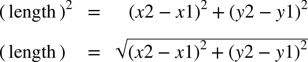
Figure out the length of the gradient vector from the
x1,y1,x2, andy2attributes, and use this for thewidthof the<pattern>. If it’s a pure horizontal or vertical gradient, this calculation is straightforward. Otherwise, use a formula based on Pythagoras’ theorem: -
Copy any values from a
gradientTransformattribute on the gradient into apatternTransformattribute on the<pattern>. -
Figure out the angle of the gradient vector, in degrees. If it’s horizontal left-to-right gradient, that’s 0, and you can skip this step. Otherwise, use trigonometry on your calculator:
Or use JavaScript in your browser’s console:
angle=Math.atan2((y2-y1),(x2-x1))*(180/Math.PI)Use the result to add a
rotate(angle)transform at the end of thepatternTransformattribute. -
Remove all attributes except
idfrom the<linearGradient>element, so it becomes a simple left-to-right, non-repeating, bounding-box gradient. All the angles and sizing and repeats anduserSpaceOnUsescaling (if required) will be handled by the<pattern>. -
Set the
heightof the<pattern>to any positive value (100% works). The pattern tiles will be repeated infinitely in the vertical direction anyway, so it doesn’t really matter. Larger values reduce the likelihood that rounding errors will cause visible edges between pattern tiles. But smaller values may be slightly better for performance. -
Add a
<rect>element inside the<pattern>, and give it the exact samewidthandheightvalues as the<pattern>. -
Set the
fillon the<rect>to be the modified<linearGradient>.

That 11-step process (with two trigonometric calculations) lets you create a paint server that does in WebKit what adding spreadMethod="repeat" could do in the other browsers.
If you want a reflecting gradient, you need a few more steps:
-
Duplicate all the
<stop>elements inside the<linearGradient>, re-arranging the second set so they are in the reverse order from the original stops. -
Divide the
offsetvalues on the original<stop>elements by 2 (because now the total length of the gradient stop-sequence is twice as long). For the new, reflected<stop>elements, set theiroffsetto 1 minus the adjusted offset of the<stop>that they are mirroring. -
Double the
widthvalue on the<pattern>and the<rect>elements.
Example 12-X3 gives the final adjusted markup for replacing the repeating and reflecting gradients from Example 12-4. Because the original gradient was left-to-right horizontal, it’s not quite as complicated as the full algorithm above. We don’t need any trigonometry or patternTransform attributes. But it’s still a lot more code than the original gradients. Figure 12-X8 shows the end result.

Example 12-X3. Using a <pattern> to synthesize repeating and reflecting linear gradients
<svgxmlns="http://www.w3.org/2000/svg"xml:lang="en"width="400px"height="200px"viewBox="-100 -100 400 200"><title>WebKit-friendly Repeatingand Reflecting Linear Gradients</title><linearGradientid="single-stripe"><stopstop-color="purple"offset="0.4"/><stopstop-color="plum"offset="0.9"/></linearGradient><patternid="purple-stripes"patternUnits="userSpaceOnUse"x="-20"width="40"height="100%"><rectwidth="40"height="100%"fill="url(#single-stripe)"/></pattern><linearGradientid="reflected-stripe"><stopstop-color="purple"offset="0.2"/><stopstop-color="plum"offset="0.45"/><stopstop-color="plum"offset="0.55"/><stopstop-color="purple"offset="0.8"/></linearGradient><patternid="purple-reflections"patternUnits="userSpaceOnUse"x="-20"width="80"height="100%"><rectwidth="80"height="100%"fill="url(#reflected-stripe)"/></pattern><circler="100"fill="url(#purple-stripes)"/><circler="100"fill="url(#purple-reflections)"transform="translate(200,0)"/></svg>

The original gradients were defined in centered, 200×200 coordinate systems. To make room for both samples, the width has been doubled, keeping the x-offset of the
viewBoxthe same.
The first pair of
<linearGradient>and<pattern>elements replace the repeating gradient. The<linearGradient>has a newid; all other attributes have been removed.
For the simple repeating-gradient pattern, the
<stop>elements and their offsets are unchanged.
The
<pattern>element has been given theidfrom the original gradient. ThepatternUnits(and by default, thepatternContentUnits) areuserSpaceOnUseto match thegradientUnitsfrom the original (in Example 12-4). Thexattribute matches the original gradient’sx1, while the width of 40 is the distance between the original gradient’s start and end points (that is, fromx1="-20"tox2="+20").
The
<rect>exactly fills up the pattern tile, and is filled by thesingle-stripegradient. Note that noxoffset is required on the<rect>: the offset from the<pattern>is already applied to the contents of each tile.
The second pair of paint servers replace the reflected gradient. There are now four
<stop>elements, to create a complete reflected set, and theoffsetvalues have been adjusted. The purple offset at 0.4 in the original is now at 0.2 and (1−0.2), or 0.8. The plum offset (originally 0.9) is now at 0.45 and (1−0.45), or 0.55.
The
<pattern>for the reflected gradient is the same as the last one except that thewidthvalue on both the<pattern>and the<rect>has been doubled, from 40 to 80, and the<rect>is filled with thereflected-stripegradient.
The two circles displaying the gradient patterns are both drawn centered on the origin, the same as in the original demo. The second one is then moved into place with a
transform, bringing its user-space coordinate system along with it.
Because these are userSpaceOnUse patterns, if the second circle had been positioned with cx instead of transform, it would have moved across the striped pattern, instead of bringing the stripes along with it. Similarly, if the circles were made larger or smaller, they would have had more or fewer stripes across each, but the stripes would have stayed the same size. However, the exact same calculations would work with object bounding box gradients—so long as you correctly adjust the patternContentUnits to match.