Drawing with Dashes
One of the most popular SVG animations uses stroke dashing to imitate the effect of a path being drawn from one end to the other.
The concept: start with a dash pattern where the entire shape is covered by a gap, and then adjust it until the entire shape is outlined by a single dash.
As you can imagine, the getTotalLength() method introduced in the book is essential for determining how long your dash and gap need to be to cover the entire stroke. To recap:
-
path.getTotalLength()returns a positive number that is the length of the path outline, measured in the user units (px units) of the local coordinate system. -
The length includes all sub-paths, but doesn’t include any jumps from move-to commands in the middle of the path.
-
You can use the method in JavaScript that will run on your website, or you can use your browser Dev Tools as a calculator, selecting the shape and calculating a length value, which you then use in your SVG or CSS code.
Because browser length calculations vary, if you’re hard-coding the numbers in advance you’ll want to slightly overestimate the length required, so that the entire path will start empty and finish stroked, in any browser.
However, if you’re animating with JavaScript anyway, it is better to can calculate the path length dynamically in the current browser, so it is always exact. You can also use JavaScript to calculate a value that you set in an inline style, which is particularly useful in combination with CSS variables.
But beware: most browsers still only support getTotalLength() on <path> elements. In SVG 2 and in new versions of Chrome, it is supported on all SVG shape elements.
There are two variations of the drawing animation method:
-
Use a fixed dash pattern consisting of a dash that is the full length of the path followed by a gap the full length as well. You can create this pattern with a single value (equal to the path length) in the
stroke-dasharrayproperty, since a single value will automatically be duplicated to create identical dash and gap values.Then, animate the
stroke-dashoffsetfrom the full length down to 0 to move the single dash into place. -
Animate
stroke-dasharraydirectly, from a zero-length dash and full-length gap, to a full-length dash and zero-length gap.The
stroke-dashoffsetcan be whatever you want, to control the point on the path where the drawing effect starts from.
Warning
Certain SVG implementations, including older Firefox versions on Linux systems, implemented stroke-dashoffset in such a way that negative and positive offsets had the reverse effect. This causes the stroke-dashoffset drawing animation to run backwards. For consistent results, animate stroke-dasharray, not the dash offset.
Example 13-X1 uses a CSS animation sequence of stroke-dasharray to complete the outlines of the heart and spade icons. It then fades in a fill color inside the outlined shapes. Figure 13-X1 compares different stages of the animation.
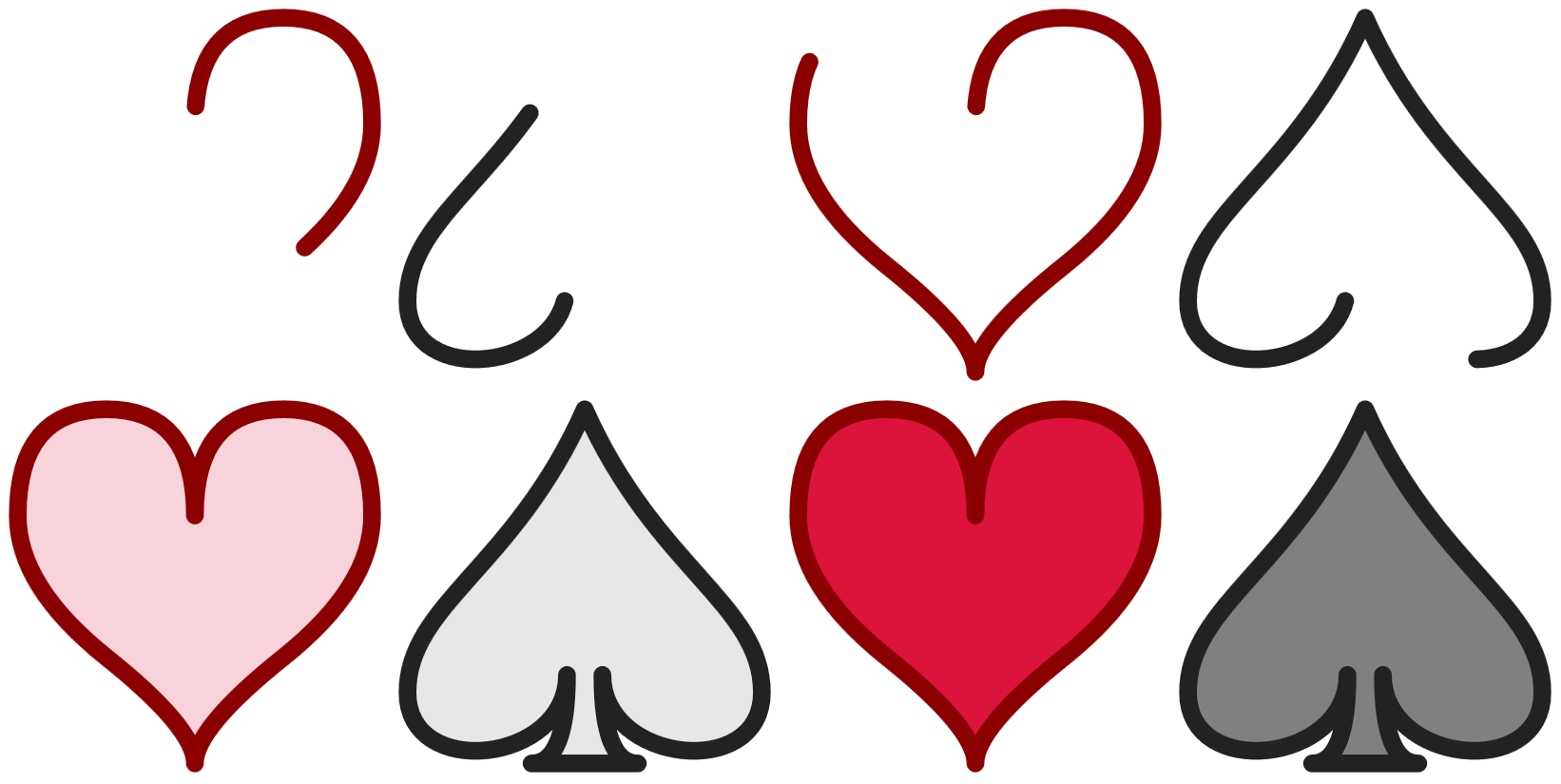
Example 13-X1. “Drawing” a shape by animating a dash pattern
<svgxmlns="http://www.w3.org/2000/svg"xml:lang="en"xmlns:xlink="http://www.w3.org/1999/xlink"width="410px"height="205px"viewBox="-1 -1 44 22"><title>Drawing SVG Shapes</title><styletype="text/css">path{stroke-dashoffset:-1;stroke-linejoin:round;stroke-linecap:round;animation:draw5sease-in;}@keyframesdraw{0%{stroke-dasharray:083;fill-opacity:0;}90%{stroke-dasharray:830;fill-opacity:0;}100%{stroke-dasharray:830;fill-opacity:1;}}</style><pathid="heart"stroke="darkRed"fill="crimson"d="M10,6 Q10,0 15,0T20,6Q20,10 15,14 T10,20Q10,18 5,14T0,6Q0,0 5,0T10,6Z"/><pathid="spade"stroke="#222"fill="gray"transform="translate(22,0)"d="M9,15C9,20 0,21 0,16S6,9 10,0C14,9 20,11 20,16 S11,20 11,15Q11,20 13,20H7Q9,20 9,15Z"/></svg>

To avoid having a dash end exactly at a corner—ruining a line join—the dash pattern is offset by 1 unit. With the
roundline joins and caps used here, the difference will not be noticeable, but with other styles it would be.
The animation property applies the
drawkeyframes, timed to last 5s, with no repeats, and uses anease-inmode to slowly ramp up the rate of change to full speed.
The initial value of the animation is set using the
0%keyframe selector. It setsfill-opacityto 0 (completely transparent) andstroke-dasharrayto a zero-length dash followed by an 83-unit gap. The length of 83 was chosen because it is slightly larger than the longest path length calculated for the spade in any browsers tested. The heart—which has a shorter path length—will be fully stroked before the animation is completed.
After 90% of the animation time has passed, the
stroke-dasharrayhas transitioned to an 83-unit dash and zero-length gap. Thefill-opacity, however, is still 0.
The transition to the final keyframe keeps
stroke-dasharraythe same, but shiftsfill-opacityto completely opaque.
Because the stroke-dasharray and fill-opacity properties are only set within the animation keyframes, browsers that do not support animation will simply present the shapes fully stroked and filled. As we will discuss in Chapter 19, it’s a good idea to always consider the fallback static version of your animated SVG. For “enter” animations like this, you usually want that static graphic to be the final appearance.