Clipped Clicks
Because clipping paths—unlike masks—are an all-or-nothing effects, they have an important usability feature that isn’t shared by masks and filters: they affect the interactive region of a shape.
Mouse and touch events will not fire on sections of a shape that have been clipped away. That means that as far as event handling, links, or :hover effects are concerned, the visible shape is the shape.
Tip
This is consistent with the behavior of hidden overflow, and the old CSS clip property: areas outside of the clipping rectangle are not sensitive to pointer events.
The difference is that the clip-path clipping shape isn’t always a rectangle!
That might not seem very exciting or surprising—it’s how you want it to work—so it is important to emphasize that it doesn’t work this way for masks, filters, or even the opacity property. Unlike clipping, those styles only affect the appearance of a shape, not its interactive region.
Warning
Internet Explorer and Microsoft Edge do not currently adjust the event-sensitive region to match the clipping path.
Be sure that your websites are still functional even if the invisible clipped parts are clickable. In particular, pay attention to how your elements overlap when they are unclipped, so that one element doesn’t block clicks on another.
Example 15-X1 is part of the code for a map of Canada, in which the shape of each province is defined (as a <path>) in a separate <clipPath>. The visible map is constructed from <image> elements—photographs of natural scenes from each province—which are then clipped into shape. Each image is a link, and opacity changes provide interactive feedback. Figure 15-X1 shows (a slightly more extensive) part of the map, with one province (Alberta) highlighted as a hover/focus effect.
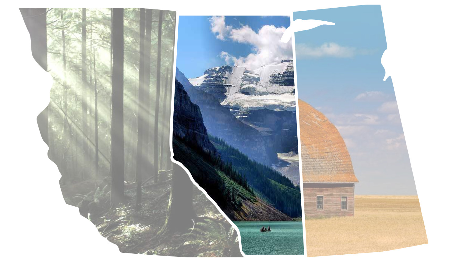
Example 15-X1. Using a clipped image to create an image-filled shape
<svgxmlns="http://www.w3.org/2000/svg"xml:lang="en"xmlns:xlink="http://www.w3.org/1999/xlink"viewBox="0 0 1500 850"preserveAspectRatio="xMidYMin meet"><title>Image Map of Canada</title><style>image{opacity:0.5;transition:1sopacity;}image:hover,a:focusimage{opacity:1;}</style><gid="Canada"transform="translate(-1000,-100)"><axlink:href="http://www.hellobc.com/"><title>British Columbia</title><clipPathid="bc-clipper"><pathid="CA-BC"d="M1010.3 33.1c..."/></clipPath><imagexlink:href="lynn-valley.jpg"clip-path="url(#bc-clipper)"aria-labelledby="bc-desc"width="1200"height="800"x="800"y="125"><descid="bc-desc">Sunbeams filter between the branches of tall trees, to light up the ferns and moss on the ground of Lynn Valley park.</desc></image></a><axlink:href="http://travelalberta.com/"><title>Alberta</title><clipPathid="ab-clipper"><pathid="CA-AB"d="M1932.54 926.55c ..."/></clipPath><imagexlink:href="lake-louise.jpg"clip-path="url(#ab-clipper)"aria-labelledby="ab-desc"width="1024"height="768"x="1300"y="150"><descid="ab-desc">Canoeists on Lake Louise are dwarfed by the Rocky Mountains rising up beside them.</desc></image></a><!--and more clipped images for other provinces--></g></svg>

The paths, created in a visual editor, were defined for a larger
viewBox, but no trouble: a simple translation transform shifts both the<image>elements and the user-space<clipPath>elements that apply to them.
We’ll talk more about the SVG
<a>link in Chapter 18, but it’s much the same as an HTML link—except for that nasty littlexlinkprefix on thehrefattribute.
The
<title>elements provide the main accessible name for the links, and also create tooltips in most desktop browsers (like thetitleattribute on an<a>in HTML).
To keep the code organized, each
<clipPath>is included right next to the<image>it modifies. To keep the book readable, we have omitted the actualdpath data for the shapes.
The
<desc>elements provide longer alternative-text descriptions for the actual images. However, since many browser and screen-reader combinations do not support<desc>, anidand anaria-labelledbyattribute re-inforce the relationship. We’ll discuss all these features in Chapter 17.
The <path> elements in Example 15-X1 were created in Adobe Illustrator, tracing the shapes from a map and then smoothing them for artistic effect—and shorter path data strings. The code was then converted to the <clipPath> and <image> structure.
From there, the exact position and scale of the <image> elements could be tweaked (by adjusting their x, y, width, and height attributes) to ensure the most artistic arrangement. This is much easier than tweaking the position of an <image> inside a <pattern> that is used to fill a <path>.
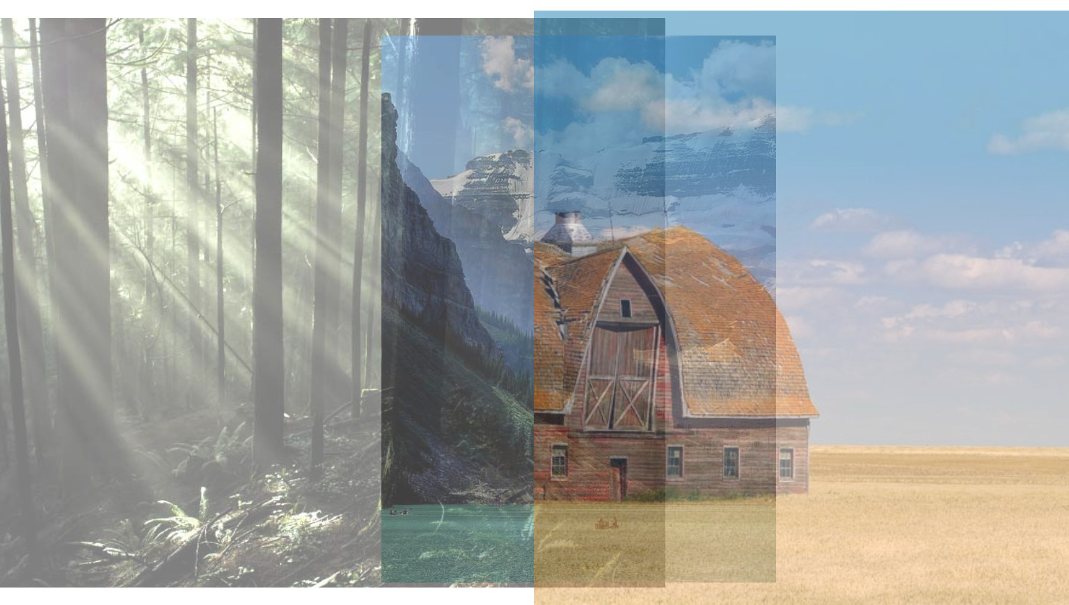
Figure 15-X2 shows what the half-transparent images would look like if the clipping paths were removed (with clip-path: none).
Because the <image> is the visible, interactive shape, it’s fairly straightforward to add a little visual interactivity to it; in this case, by using opacity and a CSS transition.
In contrast, if the <path> was the interactive shape, and the <image> was inside a <pattern>, the effect would become highly dependent on the DOM structures, since we’d neeed a CSS selector that could modify the pattern contents when the <path> (or its containing <a> element) was hovered.
This is one example of how interactive SVG can provide a replacement for the old image-map approaches you might be familiar with from the early days of the web. We look at the image-map concept in more detail—and linking in general—in Chapter 18.