Clipping on the Outside, with a Mask
For the most part, mask effects should be used when you need subtle variations or gradiations in the opacity changes. As we mentioned a few times in the book, clipping paths are much more efficient for trimming an element to crisp edges.
But there are some things a clipping-path—as they are defined in SVG or CSS—cannot do. One of the most irritating: they cannot clip away parts of a shape that are inside the clipping path while leaving the outside areas opaque.
If you want to create a transparent window in a graphic, you either need to create a donut-shaped clipping path, or you need to use a mask.
Window effects are fairly easy with (luminance) masks: just draw a white rectangle that is larger than the element you are masking, and then draw your “windows” on it in black.
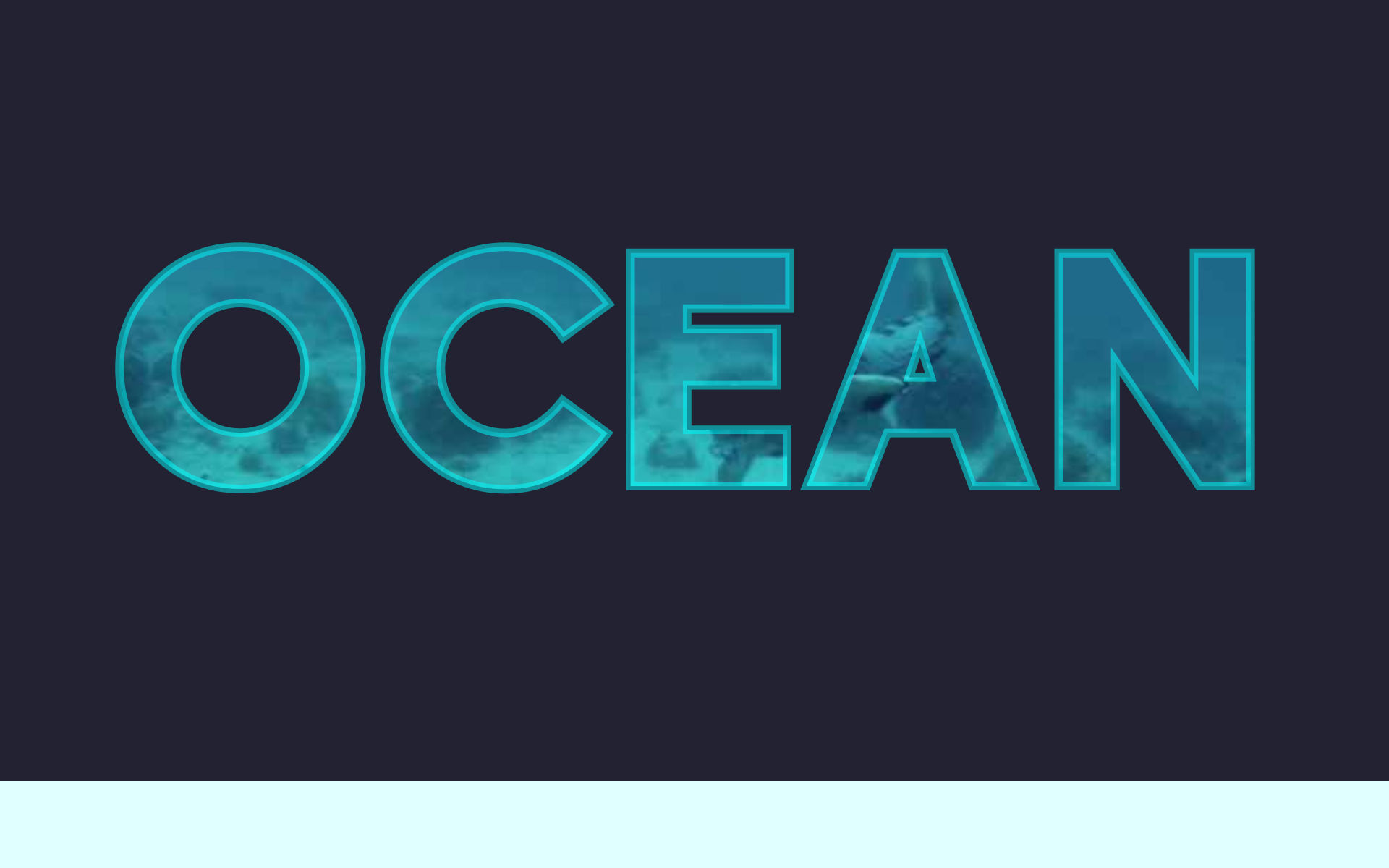
The next example uses a window-mask to create the appearance of text that is filled with a video. The letters in the “text” will actually be see-through windows in a solid SVG rectangle, created by a mask. The video will be an HTML <video> element positioned behind the SVG.
This approach works in any browser that supports SVG masks and HTML video. It therefore has much better support than applying an SVG <clipPath> directly to an HTML <video> element. (And is much, much more reliable than trying to use a <video> inside a <foreignObject> inside a <pattern> that you apply to text.)
Since the text that is drawn in the mask isn’t accessible, we’ll draw a transparent-but-accessible layer of real text over top. This is the similar to the effect created when hacking image-filled text with -webkit-background-clip: text and transparent text fill, except that we need to manually coordinate the text and clip layers.
Example 15-X2 provides the code. Figure 15-X3 shows a screenshot—although the full effect requires watching the live example!
Example 15-X2. Using a mask to create a text window to an HTML video
HTML markup:
<!DOCTYPE html><html><head><metacharset='UTF-8'><title>Video-filled Text with a Knockout Mask</title><style>/* styles could be included in the same page or as a linked stylesheet */</style></head><body><header><divclass="header-wrap"><videoautoplayplaysinlinemutedlooppreloadposter="assets/oceanshot.jpg"><sourcetype="video/webm"src="assets/ocean-small.webm"/><sourcetype="video/mp4"src="assets/ocean-small.mp4"/></video><svgviewBox="0 0 160 90"><gclass="header-backdrop"mask="url(#header-mask)"><rectid="cover"x="-5%"y="-5%"width="110%"height="110%"/></g><gclass="transparent-text"><textid="heading"class="heading-text"text-anchor="middle"x="50%"y="50%"dy="0.3em">OCEAN</text></g><maskid="header-mask"><usexlink:href="#cover"style="fill: white;"/><usexlink:href="#heading"/></mask></svg></div></header></body></html>

Attributes on the
<video>set it to start playing automatically (autoplay), preloaded for fast startup (preload), with any sound muted, so as not to startle or embarrass any viewers (muted). When it gets to the end, the video automatically restarts from the beginning (loop);playsinlineprevents it from switching to full-screen view. The video also has aposterattribute, pointing to a screenshot of a single frame from the video. This will be used as a fallback if the video does not load or play successfully.
The
<video>element has two possible sources, specified with the<source>elements: a WebM video file, and an MP4. Both videos have the same content, but the WebM file is many times smaller. The (required)typeattribute tells the browser the format of each file. Since the WebM source is listed first, modern browsers that support it will use it; the MP4 functions as a fallback, since it is a widely supported format.
The
<svg>element will be positioned over top. ItsviewBoxmatches the 16:9 aspect ratio of the video file.
The SVG contains two graphical elements: a backdrop rectangle (which will be masked to create windows for the letters) and the accessible version of the text (which will be made transparent). Neither element will have fill or stroke styles set directly, because we are going to re-use them with different styles inside our mask. Instead, each element is positioned inside its own
<g>, which is given a class name that is referenced from our stylesheet. The mask, however, is applied with a presentation attribute, since theurl(#header-mask)reference needs to be set in the same file as the<mask>element.
The markup defines the position and layout of the
<text>to center it in the SVG, but the exact font choices will be controllable by CSS.
The mask includes a copy of the rectangle, filled in white to make most of the mask opaque, and then a copy of the
<text>, drawn in the default black fill to create the windows. Both copies of the rectangle (the one that is visible and the one in the mask) are slightly larger than the<svg>itself, to avoid rounding errors that were causing a 1-pixel edge of the video to be visible in some browsers.
CSS styles:
@font-face{font-family:Biko;font-weight:700;src:url("assets/biko-black.woff");}.heading-text{font-family:Biko,sans-serif;font-weight:700;text-transform:uppercase;font-size:38px;}.transparent-text{fill-opacity:0;stroke:cyan;stroke-opacity:0.5;}.header-backdrop{fill:#223;/* matches the header background color */}body{background:lightcyan;margin:0;}header{width:100%;margin:0auto;max-width:1200px;overflow:hidden;background:#223;/* same color as SVG overlay */}@media(min-width:1200px){header{padding:0calc(50%-600px);/* add side-padding if available width is more than 1200px */}}.header-wrap{position:relative;margin:0auto;box-sizing:border-box;padding-bottom:56.25%;/* = 100% * 9/16 */max-width:calc((100vh-2em)*16/9);}header,headervideo,headersvg{max-height:calc(100vh-2em);}headervideo,headersvg{display:block;width:100%;height:100%;position:absolute;top:0;left:0;}headersvg{box-sizing:content-box;padding:5px;/* cover up edges of video completely */top:-5px;left:-5px;overflow:visible;}
A custom web font, in a heavy weight, is used for the headings.
The core font and text layout styles are set directly on the
<text>element using theheading-textclass. These styles will be shared by the copy of the text used in the mask.The accessible text layer is then made transparent with
fill-opacity, and given a bright stroke to ensure that the video-filled letters will always have sufficient contrast against the dark backdrop. These styles are set on the<g>element, so they will not be used by the text in the mask (which needs plain black fill to work).The
header-backdropclass is used to style the overlay rectangle in the SVG to match the header background color. You could of course use CSS preprocessor variables to coordinate the values in a DRY manner.The remaining styles are not directly related to the masking effect: instead, it’s all about making the
<svg>and<video>elements responsive, while still preserving their aspect ratios and alignment—including in older browsers that don’t maintain aspect ratio by default—all the while making sure the size never gets larger than the screen, or so large that the resolution of the video files is visibly degraded.Visible overflow and padding are used to allow the oversized cover rectangle in the carefully-sized SVG to extend a few pixels beyond the edges of the
<video>on all sides. The<header>itself has hidden overflow, so that extra SVG padding won’t throw off the layout.
Note
When building an earlier version of this demo, a lot of time was spent debugging what turned out to not be a masking issue, but instead a cross-browser inconsistency in CSS absolute positioning. In Chrome, setting position: absolute on an <svg> is enough to force it to be treated as a block element, meaning that the top:0 property is enough to shift it over an inline <video> element. Other browsers, however, were positioning the <svg> beside the <video>.
(This version avoids the issue by absolutely-positioning both elements, as part of the padding-bottom hack to fix scaling on older browsers.)
So take that as a reminder that, even when working with fancy new technology on the web, sometimes it’s the old CSS basics that can trip you up.
The effect is stunning, but it does require an auto-playing <video> element, which is not something we usually encourage. In this particular case, the effect is subtle, and it is part of the main content—not a distracting sidebar item—so we think it is worth it.
Warning
Some mobile browsers, including iOS Safari, do not support auto-playing video. Other browsers (including desktop browsers) have settings that allow a user to turn off auto-play.
Users may see a “play” icon button through the masked text, but won’t be able to click it, because of the transparent text on top. You could use JavaScript to listen for a click on the SVG (or header as a whole) and start the video in response.
However, for some people even subtle movement on the page can be problematic.
Unexpected or random movement on web pages—sudden scroll events, flashing or other effects—can have unwelcome sensory effects on visitors to web sites, up to and including headaches, migranes and seizures. Such vestibular disorders were impossible to detect or filter for in browser visits: the safest approach was to pause all videos by default, and allow visitors to decide whether to play videos with a click.
iOS, in contrast, has for a few years had a “prefers reduced motion” operating system setting, which turns off many animated effects. In mobile Safari (and hopefully, soon in other browsers), this setting can now be detected in CSS and JavaScript through the prefers-reduced-motion media query. In CSS, you could use it to turn off animations in transitions in an @media rule. To pause a video, however, we use the JavaScript media query API:
constvideo=document.querySelector("video");if(window.matchMedia('(prefers-reduced-motion)').matches){video.removeAttribute("autoplay");video.pause();}
You could then add play/pause buttons that the user could control.
The masking effect works in exactly the same when the video is paused, or when the poster image is displayed if the browser does not autoplay videos at all.
We talk more about accessibility concerns, and about animation and interaction, in Part V (which begins with Chapter 17).