Borrowing Ready-Made Widgets from HTML
Doing interactivity right isn’t easy on the web. You need to consider every possible way a user could interact with your website: keyboard, mouse, touch, voice control, screen reader, and more. Wherever possible, the easiest approach is to use native HTML input elements, and let the browser developers handle the accessibility.
But SVG doesn’t have native input elements (other than simple links). Does that mean you need to build everything yourself with ARIA attributes and multiple event listeners for different input types?
Not necessarily.
With inline SVG (or even with <foreignObject> in standalone SVG), you can include hidden HTML input elements in the same document as your graphic, and use them to control your SVG. The custom SVG graphics appear to be the interactive widgets, but the hidden HTML elements are controlling the state, managing the keyboard inputs from the user, and presenting the correct values to assistive technology like screen readers and voice control interfaces.
The simplest version of this is the “checkbox hack”, where you create a custom-designed checkbox (or radio button) whose appearance is controlled by the :checked pseudoclass on a clipped sibling HTML input.
Warning
Some older Android browsers (and even recent ones on BlackBerry) do not support dynamic styling with :checked. Other very old browsers do not automatically treat a click on a <label> as a click on its associated element. Depending on your browser support requirements, you may need some browser-sniffing hacks to make sure that the basic HTML input remains visible on these browsers—or on any browsers that don’t support inline SVG.
This code works on at least Android 4.0 and beyond, and Internet Explorer 9+.
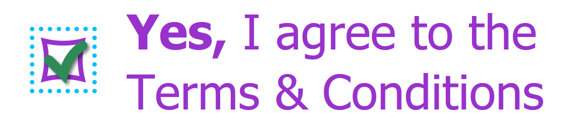
In its purest form, the checkbox hack is used to make prettier checkboxes and radio buttons. You hide the default input, and add your own (inline SVG) checkbox to the input’s <label>.
The basic markup might look something like this:
<inputtype="checkbox"class="hidden-check"id="confirmation"/><labelfor="confirmation"><svgaria-hidden="true"><usexlink:href="#checkbox-outline"/><useclass="visible-check"xlink:href="#checkbox-checkmark"/></svg><spanclass="label-text"><strong>Yes,</strong>I agree to the Terms&Conditions</span></label>
The SVG is aria-hidden because it has no meaning of its own: it only duplicates the meaning of the hidden checkbox.
The relevant CSS hides the real checkbox, and then styles the SVG checkbox according to the :checked state:
.hidden-check{position:absolute;clip:rect(0,0,1px,1px);}.hidden-check+label.visible-check{opacity:0;transition:opacity0.3s;}.hidden-check:checked+label.visible-check{opacity:1;}
When the checkbox is selected—by keyboard activation or by clicking or tapping on the label—the SVG checkmark will fade into view. Since the SVG itself is part of the <label>, clicking or tapping on the visible checkbox will have the same effect, toggling the checkmark on and off.
The <input> checkbox itself is hidden—while still being interactive—using absolute positioning and the clip property. Visually hiding an interactive element is the only recommended use for this otherwise deprecated property. (Alternatively, you can use opacity: 0.01. For maximum screen-reader compatibility, don’t make it completely transparent or offscreen.)
Example 18-X1 gives a complete set of styles and SVG markup, including :focus styles. Figure 18-X1 shows what our checkbox looks like when it is both focused and checked—or more precisely, it shows what the custom label looks like when the hidden real checkbox is both focused and checked. View the live example in your browser.
Example 18-X1. Creating a custom checkbox with hidden HTML, inline SVG, and CSS pseudoclasses
<!DOCTYPE html><htmllang="en"><head><metacharset="utf-8"/><title>Custom Accessible SVG Checkbox</title><style>body{font-size:250%;font-family:sans-serif;color:darkOrchid;}.hidden-check{position:absolute;clip:rect(0,0,1px,1px);}label>svg,label>.label-text{display:inline-block;vertical-align:middle;}label>svg{width:1em;height:1em;margin:00.5em;overflow:visible;}label>.label-text{max-width:calc(100%-3em);}.hidden-check+label.visible-check{opacity:0;transition:opacity0.3s;}.hidden-check:checked+label.visible-check{opacity:1;}.hidden-check:focus{outline:none;}.hidden-check:focus+label>svg{outline:dotteddeepSkyBlue;outline-offset:0.1em;}</style></head><body><svgclass="defs-only"width="0"height="0"aria-hidden="true"focusable="false"><symbolid="checkbox-outline"viewBox="0 0 10 10"overflow="visible"><pathstroke="currentColor"fill="none"d="M1,1 Q5,2 9,1 Q8,5 9,9Q5,8 1,9 Q2,5 1,1Z"/></symbol><symbolid="checkbox-checkmark"viewBox="0 0 10 10"overflow="visible"><pathstroke="seaGreen"fill="none"stroke-width="2px"stroke-linecap="round"filter="drop-shadow(0.5px 0.5px 0.3pxrgba(0,0,0,0.5))"d="M2,5 L5,8 Q6,4 9,2"/></symbol></svg><form><!-- The rest of the form goes here --><inputclass="hidden-check"type="checkbox"id="confirmation"/><labelfor="confirmation"><svgaria-hidden="true"><usexlink:href="#checkbox-outline"/><useclass="visible-check"xlink:href="#checkbox-checkmark"/></svg><spanclass="label-text"><strong>Yes,</strong>I agree to the Terms&Conditions</span></label><!-- Submit button goes here --></form></body></html>
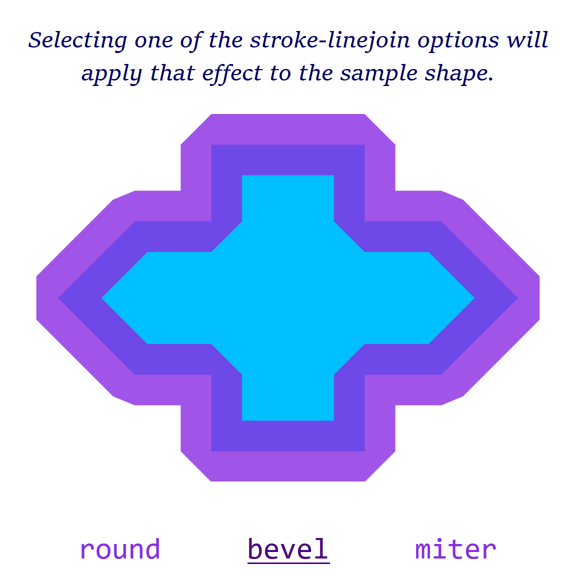
The same approach can be used to create larger interface switches, separate from a form input. For example, we could use HTML radio buttons to finally create the optimal interactive semantics for our stroke-linejoin demo (which was last updated in Example 18-7).
To recap:
-
We have a demo SVG graphic, and three options for how to style it (round, bevel, or miter line joins).
-
Since the three options are mutually exclusive (only one can be active at a time), this is logically a radio button control.
-
The normal keyboard behavior of radio buttons is that you use Tab to focus or un-focus the group as a whole, and use arrow keys to cycle between the options.
-
However, our previous demos used SVG links and
:targetstyles to apply the interaction; each link was a separate tab stop. -
We couldn’t reliably use the
focus()method to listen for arrow keys and control focus ourself, becausefocus()doesn’t have cross-browser support on SVG elements.
Example 18-X2 converts our all-SVG demo into an HTML web page with inline SVG, controlled by HTML radio-button <input> elements.
The SVG <text> labels have been replaced by HTML <label> elements below the inline SVG. Each label element is matched to the corresponding <input> with the for attribute, which references the input’s id (without a # URL hash).
Figure 18-X2 shows the web page in action. View the live example in your browser.
Tip
Although we’ve added distinct :focus versus :checked styles for the labels, most browsers automatically switch a radio button selection when you arrow through the choices. But they are conceptually different states, so it’s good to keep them separate.
Because the current selection is now maintained by the HTML radio button group, not by the target fragment in the URL, you could add a second radio group controlling a separate property (stroke-linecap, maybe?) and an independent set of labels.
It’s a lot of CSS code, and it’s undeniably a hack of the <input> element’s intended purpose, but it works.
The HTML <label> elements automatically transfer mouse clicks to the hidden radio buttons, so the demo works for mouse and touch users as well as keyboard users.
If we wanted to keep the visible labels as SVG text, we would have needed JavaScript to respond to clicks and update the HTML inputs accordingly. We would have also needed aria-labelledby to connect the <input> elements to their SVG labels, since the for attribute only works on <label>.
JavaScript is also required for more complex inputs (like range sliders), whose current values aren’t accessible through CSS pseudoclasses. But instead of having to code all the keyboard listeners and accessibility behaviors for a fully-functioning slider, you can just listen for change events on the hidden HTML <input type="range"> and update your SVG accordingly. Just remember to also update the input’s value to match whatever click-and-drag behavior you’re using for mouse and touch users.
The same concept could even be extended to text boxes. You’ll need to listen for focus changes and keypress events on the hidden text box, and then retrieve the current text content and selection range, and use that to update your SVG text representation of the input. You’ll also need to listen for selection events on the SVG text itself—so that mouse users can select the text they want to change—and transfer those selections and the keyboard focus to the hidden input.
Which is a lot of code, but still less than coding a fully-functional text input from scratch.
As we mentioned in Chapter 15, the HTML contenteditable attribute can also sort-of apply to inline SVG, by applying it to a parent HTML element. But you’ll still need to add a bit of JavaScript, to prevent the focus from dropping out of your SVG text elements if the user deletes the text completely. There is currently no support (in the spec or in most browsers) for contenteditable on individual SVG elements. Hopefully, it will be added in the future.