Using SVG/SMIL Animation Elements
Without cross-browser support, the SVG/SMIL animation elements are of limited use on the web. But there are still numerous effects they can create that CSS animations and transitions can’t, so SVG/SMIL can be useful for quickly adding non-essential animations which don’t justify loading a JavaScript animation library.
To recap our introduction from the book: Most SVG/SMIL animations will use the <animate> element. Attributes on that element describe the changes you want to apply to an attribute or style property of another element in your SVG.
All the attributes for declaring animations#
There are a lot of different attributes for controlling SVG/SMIL animations. There is a more detailed reference, with all the syntax details, in “Animation Elements” section of our markup guide; this is a more conceptual overview.1 The attributes can be grouped into the following categories:
- Setting the target element and attribute#
-
The target element is identified with an
xlink:hrefcross-reference; it defaults to the animation element’s parent (which could be a shape, group,<use>element or pretty much any other element in SVG).The target attribute or style property is set with
attributeName. By default, the animation will affect the style property, if one exists by that name. You can useattributeType="XML"to force the browser to animate the XML attribute instead of a CSS property by the same name. This is important for animatingwidthandheightand so on. - Setting the new value(s)#
-
The changed value(s) for your attribute or style is set with one of the
to,by, orvaluesattributes, and optionally withfrom:-
tois the final value of the property/attribute -
byis an amount to increase or decrease the value -
fromis the initial value (which defaults to the base value on the element) -
valuesis a sequence of keyframe values—including the “from” and “to” values—as a semicolon-separated list (if you use it, the other attributes are ignored)
The
fill="freeze"attribute forces the ending value to be preserved indefinitely, unless you set a different animation on the same element or restart this animation. -
- Setting duration and repeats#
-
The
durattribute sets the duration time of a single cycle of the animation; without a fixed duration, the animation won’t progress past thefromvalue. You can cause that cycle to repeat by settingrepeatCount(a number of cycles) orrepeatDur(a total duration time). By default (without eitherrepeat*attribute), the animation only runs once.Either
repeatCountorrepeatDurcan beindefinite(not “infinite”) for unlimited repeats. If you set both repeat measurements, the first one to finish terminates the animation. You can also set amax(maximum) total duration time or amin(minimum) time; however,mincan’t cause extra repeats, it only affects indefinite animations ended withend. - Setting beginning and ending times#
-
Animations have a
begintime and anendtime, which causes all repeats to end.beginis by default at0s, relative to the document loading time;endis by default determined by the duration and repeat attributes. Both values can be a semicolon-separated list of multiple times.In addition to beginning or ending at a specified time, you can begin or end an animation in response to an event. Events are specified using the DOM event name, like
mouseover(for a mouseover event on the animation’s target element) orbutton1.click(for a click event on an element in the document withidofbutton1). Animation elements createbeginandendevents, plus numbered repeat events likerepeat(1), so you can set one animation to begin or end in sync with another. You can also set time offsets from an event, likebegin="otherAnimation.end - 1s"to start this animation one second before the other animation is due to end.Multiple begin times or event triggers can cause an animation to interrupt itself; the
restartattribute can limit restarts, to onlywhenNotActive(i.e., not currently running) orneverat all. - Setting pacing between keyframes#
-
By default, multiple keyframe
valuesare evenly distributed in the duration of an animation cycle, and the actual values are interpolated in a linear fashion between each keyframe. You can change the keyframe positions withkeyTimes, which take a semicolon-separated list of numbers between 0 and 1 (like the percentages in CSS keyframes, but converted to decimals).You can switch interpolation methods with the
calcModeattribute, todiscrete,paced, orspline(the default islinear). “Spline” interpolation is cubic Bézier easing, and only works if you also setkeyTimesandkeySplines. The values inkeySplinesare cubic Bézier control points (four numbers, like the ones in the CSScubic-bezier()function), with multiple sets of four numbers (one for every pair of consecutivevalues) in a semicolon-separated list. - Setting additive effects#
-
The
additiveandaccumulateattributes allow animations or repeats to sum together; we’ll discuss them in “Additive and accumulative animations”.
Are you confused yet?
Learning SVG/SMIL takes a lot of practice and a lot of double-checking the specs. There are so many possible options, but there are also lots of annoying cross-dependencies, like not being able to use from without either to or by, and not being able to use keySplines without keyTimes, even when you aren’t changing the keyTimes default!
So why bother?
Because there are some things that SVG/SMIL can do really easily that are currently difficult or impossible with CSS animations. The next couple sections look at some of those cases.
Synchronized animation timelines#
One of the biggest benefits of SVG/SMIL relative to CSS animations are the synchronized timing options. These allow you to create an entire script of different short animations.
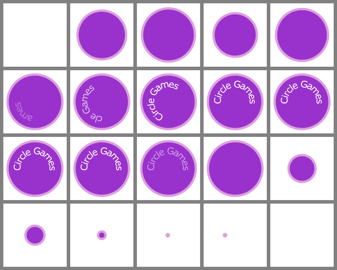
To demonstrate, we’ll create an animated logo, similar to the “stingers” that movie and TV production studios use at the beginning or ends of films. The logo is about as basic as a logo can get, as shown in Figure 19-X1: a circle, with the words “Circle Games” arranged in a circular <textPath>.
To give this simple logo a little pizzazz, we’re going to:
-
animate the circle up from nothing (like we did in Example 19-2), but then have it bounce bigger and smaller for a few seconds before settling down.
-
Rotate the text into place around the circular text-path, fading it in to full opacity as the letters appear.
-
Hold the full logo in place a few seconds.
-
Fade the text out again, but without moving it.
-
Shrink the circle down to a dot, with some easing effects to give it a jump at the end.
-
Roll the dot off the side of the screen, accelerating as it goes.
Figure 19-X2 shows the animation sequences as a series of stills, taken at one-second intervals for twenty seconds. For something a little more exciting, view the final live animation.
Tip
The SVG DOM has methods for SVG/SMIL animations that can help with taking still screenshots—among other uses.
Every <svg> element has pauseAnimations() and unPauseAnimations() methods, plus a setCurrentTime() method that accepts a time in seconds. These all affect all animations in the document.
Each animation element also has beginElement() and endElement() methods.
Before we get into the code, we’ll introduce one more animation element.
Although the <animate> element is the general workhorse for most attribute animations, for simple discrete changes it is usually easier to use <set>.
A <set> element applies the to value to the target attribute or property for as long as the animation is active. In other words, it sets the attribute to the new value for a specified amount of time (dur) or until the end trigger. There is no transition time—the change is always discrete—and there is no way to apply a sequence of values or to change the value by a relative amount.
In other words, the main benefit of <set> is that it lets you avoid writing calcMode="discrete" over and over again. Also, it makes your code a little more clear.
So the following <set> element would ensure that its parent element disappears when the element with id="button1" is clicked, and isn’t displayed again until the element with id="button2" is clicked:
<setattributeName="display"to="none"begin="button1.click"end="button2.click"/>
(Of course, for accessibility purposes you’d want make sure that button1 and button2 are actually <a> links that can be “clicked” with the keyboard, too.)
Warning
Theoretically, the event trigger elements could be other (non-SVG) elements in the same document. In other words, they could be HTML <button> elements in a document with inline SVG. But that doesn’t work in Chrome, which only listens for these events on SVG elements.
In Example 19-X1, we use a <set> to hide the logo text until it is ready to be animated in. The remaining changes are all defined with <animate> elements, that modify the circle’s radius (r), or its horizontal position (cx), the text’s opacity, and the <textPath>’s startOffset position.
Example 19-X1. Creating a complex animation sequence from synchronized animation elements
<svgxmlns="http://www.w3.org/2000/svg"xml:lang="en"xmlns:xlink="http://www.w3.org/1999/xlink"width="100%"height="100%"viewBox="-220 -220 440 440"><title>Reveal and Disappear Animated Logo</title><circleid="c"r="190"fill="darkOrchid"stroke="plum"stroke-width="16"/><defs><pathid="p"d="M0,125 A125,125 0 0,1 0,-125 A125,125 0 0,1 0, 125Z"/></defs><textid="t"dy="0.7ex"text-anchor="middle"font-size="48pt"font-family="Verdana"fill="white"><textPathid="tp"xlink:href="#p"startOffset="50%">Circle Games</textPath></text><setid="textHide"xlink:href="#t"attributeName="visibility"to="hidden"end="textFadeIn.begin"/><animateid="circleGrow"xlink:href="#c"attributeName="r"values="0;215;100;205;140;195;170;190"dur="5s"/><animateid="textPathSlide"xlink:href="#tp"attributeName="startOffset"from="-20%"to="50%"dur="4s"begin="circleGrow.end - 1s"/><animateid="textFadeIn"xlink:href="#t"attributeName="opacity"from="0"to="1"dur="3s"begin="textPathSlide.begin"/><animateid="textFadeOut"xlink:href="#t"attributeName="opacity"to="0"fill="freeze"dur="2s"begin="textPathSlide.end + 3s"/><animateid="circleShrink"xlink:href="#c"attributeName="r"to="8"fill="freeze"dur="3s"begin="textFadeOut.end + 0.1s"calcMode="spline"keyTimes="0;1"keySplines="0.2,0.9,0.9,0.5"/><animateid="circleMove"xlink:href="#c"attributeName="cx"by="-500"fill="freeze"dur="3s"begin="circleShrink.end"calcMode="spline"keyTimes="0;1"keySplines="0.5,0,0.8,0"/></svg>

To keep the file organized, all the code for drawing the shapes and text is given first, then all the animation elements are listed together, ordered by their start time. We’ve also given all the animation elements
idvalues for consistency (and to document the code), although only some of them are used to synchronize begin/end times.
The graphic is a stroked circle and then a
<textPath>. The<path>for the<textPath>isn’t drawn itself; it describes a 125px-radius circle that starts and ends at the bottom.
The first animation is the
<set>that hides the text until it’s needed. It starts at 0s (by default) and is ended by the beginning of thetextFadeInanimation.
The
circleGrowanimation also begins by default as soon as the document loads. It modifies the circle’srattribute, in an alternating series of values spread out over 5 seconds.
The motion of the text on the path (
textPathSlide), created by animating thestartOffsetattribute, starts one second before the circle animation has completely settled.
The
textFadeInanimation (changing opacity) is synchronized to start withtextPathSlide, and it in turn triggers the end of thetextHide<set>element. All of these timing connections are based on the logical dependencies of the content, so that if the timing of one step is tweaked later, other animations will adjust to match.
The fade-out starts three seconds after the end of the text motion, and freezes the text as transparent.

A mere tenth of a second after the text disappears, the circle starts shrinking down to the 8px radius that will mean that only the stroke is visible. The motion uses a cubic Bézier spline that starts relatively fast, slows down, then speeds up again. You can calculate these spline values using the same tools as for CSS
cubic-bezier()timing functions.
The final animation, that moves the circle left by 500px, also uses spline easing, this time to create an accelerating effect. The final position is frozen, well off screen (even if the
viewBoxdoesn’t take up the full<svg>dimensions).
The base values for all those attributes are defined such that, without SVG/SMIL support, the static logo is shown, with the circle full size and the text neatly centered.
Animating complex motion#
In addition to <animate> and <set>, there are two specialized SVG animation elements for creating animated transformations:
<animateTransform>-
Applies one particular transformation function to the target element. The
typeattribute specifies which type of transformation (translate,scale,rotate, etc.), while theto,from,by, orvaluesattributes specify the parameters to the transformation. <animateMotion>-
Moves the target element, similar to translational (and rotational) transformations. However, instead of defining the transformation using the normal syntax, you describe where you want the element to go. The path of the motion can be defined as a series of translations, or as an SVG path through the coordinate system.
You can optionally make the shape auto-rotate to match the angle of the path (similar to how the letters are rotated in a
<textPath>layout), withrotate="auto".
Warning
The SVG 1 spec also included the SMIL <animateColor> element, but it didn’t add any function, because <animate> could animate colors in SVG. The element was deprecated in SVG 1.1 and is no longer supported in Chrome. Use <animate> instead.
In SVG 1.1, <animateTransform> and <animateMotion> are the only way to get smooth transitions of tranformations: the spec did not define rules for animating the full transformation lists from one value to another. Those rules are defined in the CSS Transforms Module, so you could theoretically animate transforms with <animate>, but only if any of the browsers had updated their implementations.
We’ll show an example of <animateTransform> in the next section, when we discuss additive animations. For this section, we’re focusing on <animateMotion>.
In the original SMIL version of <animateMotion>, you specified x and y translation distances in the to, from, by, or values attributes.
You can do that with SVG/SMIL, but it is mostly equivalent to an <animateTransform> with type="translate". The differences are:
-
You can rotate the shape to match the direction of the motion (but this isn’t supported in Chrome).
-
You can use lengths with units in
<animateMotion>values (but this isn’t supported in Chrome). -
The default
calcModeispacedinstead oflinear(Chrome gets this part correct).
A paced animation means that the speed stays steady throughout the entire animation. In contrast, with linear and spline modes, the total duration is divided up into separately-timed transitions for each value in the list. Consider the following animation:
<animateMotionvalues="0,30; 40,0; 80,30; 0,30"rotate="auto"dur="9s"repeatCount="indefinite"/>
Those four (x,y) pairs in values, with the last pair repeating the first, create an isoceles triangle, as shown in Figure 19-X3. The sides of the triangle have lengths of 50, 50, and 80 units; the total path length is 180 units.
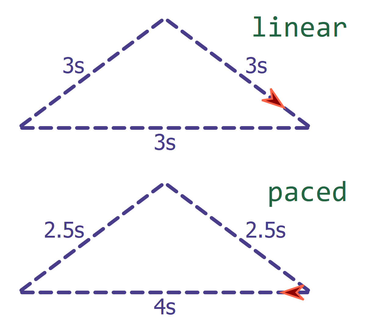
calcModeA linear mode would divide the total animation into 3 equal steps (unless you set keyTimes). For the 9s animation, that would mean 3 seconds for each side of the triangle. The shape would move more slowly on the shorter sides and faster on the long side.
For the paced animation, the total 180-unit distance would be divided by the 9s total duration; any keyTimes attribute would be ignored. The shape moves 20 units per second along the entire triangle.
Tip
You can also set calcMode="paced" for any animation where the values are numbers or colors. (The same types of properties that work with additive animations.) The “distance” for colors is the distance across the RGB cube, as if each color channel was a different direction in 3D space.
The animation will pass through all the values you specify, in the order you give them, but the overall rate of change will stay constant.
The most interesting use of <animateMotion> is to apply motion along an SVG path. This allows you to define motion along curves which can’t be broken down into a series of linear translations. It also means that Chrome will support auto-rotation.
The motion path you use can be set two ways:
-
in the
pathattribute of the<animateMotion>element, using SVG path data syntax; or, -
as a cross reference to a
<path>element, specified using thexlink:hrefattribute on an<mpath>element that is a child of the<animateMotion>.
The <mpath> element has no other attributes; it only exists because the main animation elements already had an xlink:href attribute for identifying the target element—and because SVG 1 insisted on using xlink:href for all cross references other than style properties.
Example 19-3, in the book, used <animateMotion> and <mpath> to create an infinitely spinning loader, of multiple beads moving along the same path.
Additive and accumulative animations#
Compared to the complex patterns you can create with <animateMotion>, a single <animateTransform> element isn’t particularly interesting. It can only apply a single transformation function: either a rotation or a translation or a scale or a skew.
You could create complex motion with <animateTransform> by nesting elements with different transformations: an element with a translation inside a group with a rotation, for example. Nesting elements like this is currently the recommended approach for animating complex transformations with CSS.
But sometimes, you don’t want to add all those nested <g> elements. And sometimes, it’s not even an option—for example, inside a <clipPath> where groups are still forbidden.
SVG/SMIL has a solution: additive animations. Multiple independent animation elements, animating the same property on the same element, that can add together in their effect.
Tip
Additive animations are particularly useful for <animateTransform>, but can also be used for most numerical or length attributes, or for colors.
You define an additive animation by setting the additive attribute to sum.
The default value for additive is replace: animations that start later replace earlier animations of the same property on the same element. For multiple animations that start at the same time, the last element in the document wins (similar to CSS rules).
Example 19-X2 uses additive <animateTransform> animations to create a complex motion pattern. The example creates the appearance of X-Ray glasses or goggles, seeing through a photograph (of one of the authors, Kurt). Figure 19-X4 shows sample screenshots.
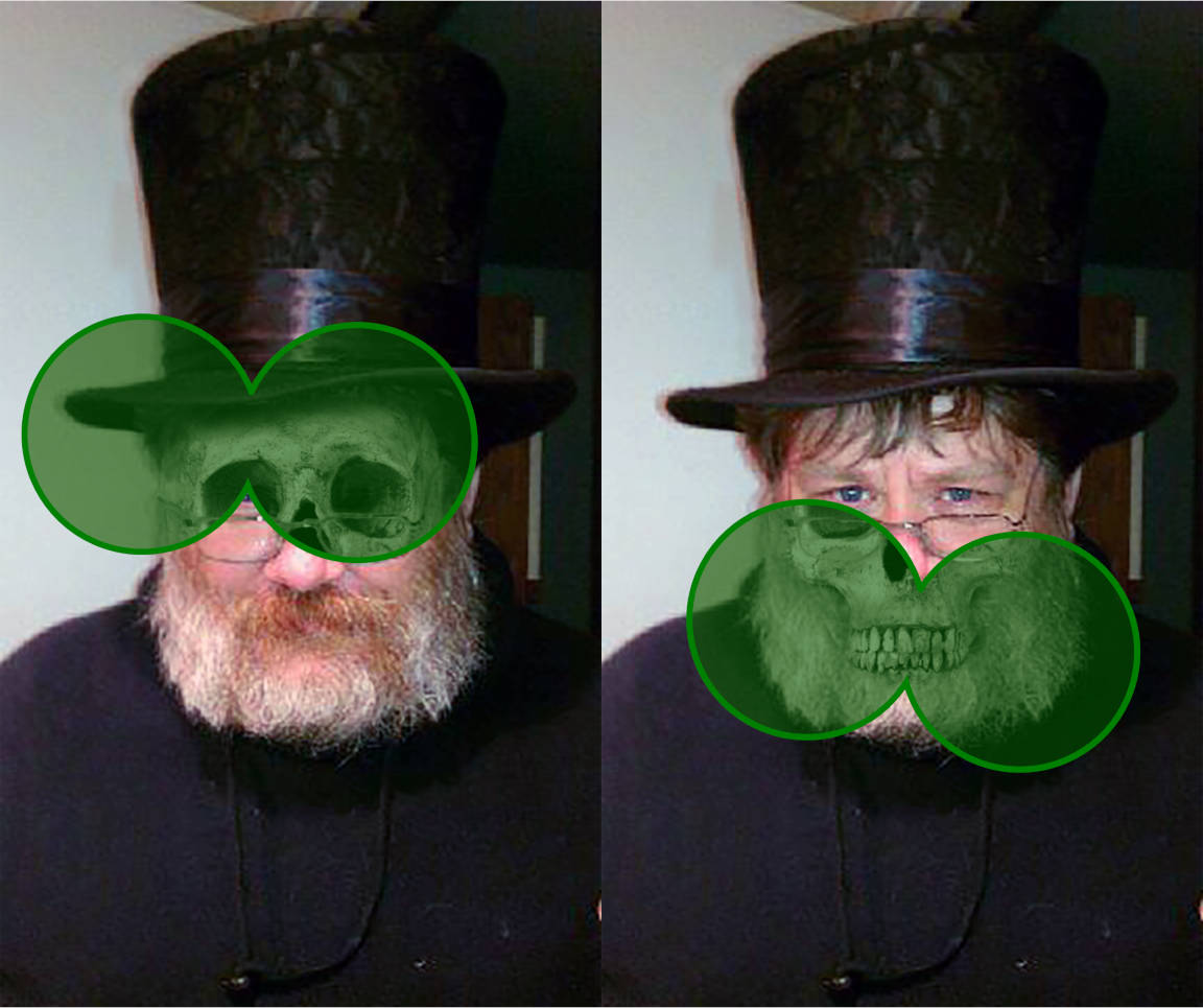
Example 19-X2. Creating complex transformation patterns with additive animations
<svgxmlns="http://www.w3.org/2000/svg"xml:lang="en"xmlns:xlink="http://www.w3.org/1999/xlink"viewBox="0 0 384 643"width="384px"height="643px"><title>X-Ray Scanner</title><imagexlink:href="TopHatKurt.jpg"width="100%"height="100%"/><imagexlink:href="TopHatSkull.jpg"width="100%"height="100%"clip-path="url(#cp)"/><pathid="goggles"d="M0-30 A75,75 0 1,1 0,30 A75,75 0 1,1 0,-30Z"fill="green"fill-opacity="0.4"stroke="green"stroke-width="4"><animateTransformattributeName="transform"type="translate"values="200,40;200,600;200,40"dur="10s"repeatCount="indefinite"/><animateTransformattributeName="transform"type="translate"values="-50,0;50,0;-50,0"dur="3s"repeatCount="indefinite"additive="sum"/><animateTransformattributeName="transform"type="rotate"values="-10;10;-10"dur="7s"repeatCount="indefinite"additive="sum"/></path><clipPathid="cp"><usexlink:href="#goggles"/></clipPath></svg>
Most of the magic of this example comes from the two perfectly matched JPEG photographs, one of which has been edited to create a black-and-white “X-ray” view. The X-ray photo is drawn on top, but is clipped to only be visible through the “goggles”.
The X-ray goggles are drawn with a path containing two large circular arcs, centered on the origin. The path has a semi-transparent green fill—through which we’ll see the image below—and a solid green outline.
The first
<animateTransform>element positions the goggles in the horizontal center of the SVG, and then moves them down and back up over 10 seconds, from y=40 to y=600, keeping the x-position constant at 200. It (and the other animations) repeats indefinitely.The second
<animateTransform>translates the x values back and forth while keeping y steady. Theadditive="sum"attribute is essential, so this translation is added to the previous one, instead of replacing it.The third
<animateTransform>is of typerotate, rocking the goggles 10° in either direction; again, this transformation adds on to the previous ones.The final, animated
<path>is cloned into the<clipPath>which is used for the X-Ray photograph. The clipping of the photograph therefore stays in sync with the visible goggle outline.
Example 19-X2 demonstrates another limitation of the SMIL syntax: in order to create an alternating (back-and-forth) animation, you need to repeat values in an a;b;a sequence in the values attribute.
Aslo note that the attributeName is required, even for <animateTransform>: the <animateTransform> element can also animate gradientTransform and patternTransform attributes.
Warning
The original version of Example 19-X2 animated a shape inside <defs>, and then drew the green outline with a <use>. However, Firefox (since version 31) has a bug where the <use> doesn’t get updated with the animations—except for when the <use> is inside the <clipPath>, when it is strangely unaffected by the bug.
Since the <clipPath> effect ignores strokes and fill, we were able to work around the bug by drawing the visible element directly and then re-<use>-ing it in the clipping path.
The motion of the X-ray goggles, as they scan the image, consists of three components:
-
a slow movement up and down,
-
a much faster movement side-to-side, and
-
rotational movements to angle the goggles first one way, then the other.
None of these animations would be particularly interesting on their own; it is the additive effect that creates the complex motion.
Because none of the durations of the animations are even multiples of the other, the cumulative pattern appears imprecise and more natural. It does not repeat exactly until three and a half minutes have passed (210s, the least common multiple of 10, 3, and 7).
Note
Creating pseudo-random patterns by layering together multiple repeating elements that don’t match up precisely is known as the cicada principle. Cicadas are insects with multi-year lifespans, most of which is spent underground. Some species have very predictable lifespans, but because the cycles don’t line up from one species to another, you can get uneven bursts in the adult population numbers.
Or something like that. It doesn’t really have anything to do with the insects, it’s just a name for the design technique.
In addition to its use in animations, the cicada principle can be used in SVG to create complex visual patterns by layering together semi-transparent repeating patterns or gradients. The sizes of the repeats—whether in visual space or in time—should not divide neatly one into the other.
In addition to additive animations, which is one animation element adding on to another, SVG/SMIL defines accumulative animations, where each subsequent repeat of an animation adds on to previous repeats.
The relevant attribute is accumulate and the non-default value is once again sum. (The default value is none.)
This is most useful if you want to create an animation that proceeds in steps, instead of in a single smooth transition. Without accumulation, this would require setting a large list of intermediary values, so you could set discrete transitions or individual easing curves for each setp.
With accumulation, the animation describes the relative change for each step and the number of repeats required to reach the final sum. The calcMode and related attributes describe how each step should progress.
Example 19-X3 gives the code for an accumulative animation increasing the radius of a circle. Each cycle uses keySplines easing to add a pauses, puffing out quickly and then slowing at the end of the repeat. It’s not much to look at in a static screenshot, but you can view the live SVG in a browser with SVG/SMIL support. The appearance is somewhat like a balloon being inflated by a series of big breaths.
Example 19-X3. Using accumulative repeats and spline easing to create a pulsed animation
<svgxmlns="http://www.w3.org/2000/svg"xml:lang="en"viewBox="-80 -80 160 160"width="4in"><title>Accumulative Animations</title><circler="75"fill="crimson"><animateattributeName="r"from="0"by="10"calcMode="spline"keyTimes="0;1"keySplines="0.1,1 0.9,0"dur="1s"repeatCount="7.5"accumulate="sum"/></circle></svg>
Warning
The original version of this demo used a keySplines value of 0.3,2,0.7,-1 to create a “bounce” effect on each repeat. It worked in Chrome—and in CSS timing functions—but is contrary to the SMIL specs and not supported in Firefox. The keySplines values must all be between 0 and 1.
Example 19-X3 also demonstrates that repeatCount does not have to be an integer; here, it takes 7.5 repeats to sum up to the desired radius.
1 SVG Essentials, Second Edition, by J. David Eisenberg and Amelia Bellamy-Royds, has a slightly more comprehensive discussion.