The Next Dimension: 3D Transformations
The CSS transformations module includes three-dimensional transformation functions. They allow you to move your flat vector graphics around in three-dimensional space as if they were cut out of incredibly thin—but incredibly sturdy—paper. Or perhaps rubber would be a better description than paper, since you can still stretch your graphics using scale and skew!
It isn’t a full 3D environment (since you can’t create three-dimensional curves), but you can build boxes and other three-dimensional structures with flat surfaces.
Warning
All the 3D transformation functions described in this section should be considered “future” SVG. Support is inconsistent between browsers. Even when applied to HTML elements, there are many bugs and edge cases. Recognizing this, the CSS working group has separated all the 3D transformation functions into a CSS Transforms Level 2 module.
A three-dimensional transformation consists of two steps:
-
Transformation functions that manipulate the plane on which your graphic is drawn, in a theoretical 3D space.
-
Perspective effects that then convert them to a flattened representation that can be drawn to your computer screen.
The transformation functions are extensions of the basic 2D transformations, applied to a 3D coordinate system. The third axis, z, is initially pointing out of the screen towards the viewer: positive z coordinates are “in front” of the screen, negative z coordinates are behind it. Factoring in the normal x and y directions in SVG, this creates a left-handed coordinate system.
Knowing that you’re working in a left-handed system can be useful when you twist and rotate the coordinates until the x and y axes are no longer anywhere near vertical and horizontal. There are a number of heuristics that can be used to keep your bearings in a transformed three-dimensional coordinate system. Figure 11-X1 shows one heuristic: using your left hand, if your thumb is oriented towards the positive x-axis, and your index finger points straight out towards the positive y-axis, then your bent middle finger will point towards the positive z-axis.

An alternative heuristic—with the same result—is to hold your left hand out flat with the fingers pointing towards the positive x-axis, then curl your fingers in towards the positive y-axis (the curl they make will follow the direction of a positive angle rotation); if you stick out your thumb, it points towards the positive z-axis.
The left-handed orientation is preserved through translations and rotations, but not when you apply a negative scale. Since a negative scaling factor on one dimension creates a reflection of the coordinate system, this mirrors the left-hand system into a right-hand system. If you apply a negative scale to two axes, you flip it back to left-handedness, and so on.
Your graphics all start as flat drawings in the x/y plane, with z coordinate 0. The following 3D transformation functions can shift the position of that plane in the 3D coordinate space:
-
translate3d(tx, ty, tz): translate it by the given lengths along each axis -
translateZ(tz): similar to the newtranslateXandtranslateYfunctions, this shorthand allows you to specify a translation along the z-axis only -
scale3d(sx,sy,sz): change the scale in all dimensions by the specified factors -
scaleZ(sz): change the z-scale only (similar to the newscaleXandscaleYfunctions) -
rotateX(a): use the x-axis as a pivot (or hinge) to rotate the coordinate system by the specified angle; x-coordinates will not change, but y and z coordinates will -
rotateY(a): use the y-axis as a pivot to rotate the coordinate system by the specified angle; y-coordinates will not change, but x and z coordinates will -
rotateZ(a): use the z-axis as a pivot to rotate the coordinate system by the specified angle; this has the same effect on coordinates as the 2Drotatefunction, but it forces 3D drawing methods to be used -
rotate3d(vx,vy,vz,a): create a pivot using the vector (straight line) from the origin to the point (vx,vy,vz), and rotate the coordinate system around it by the angle a. The official definition of how to calculate the rotation involves extensive trigonometry. As an heuristic, the direction of rotation for a positive angle is determined by pointing the thumb along the pivot vector, and then curving the fingers; as always, you would use the left hand for the default coordinate system and the right hand for a reflected coordinate system.
For all these functions, the CSS syntax rules apply: angles and lengths must include units.
Tip
Although x and y lengths can be percentages, z lengths cannot. All SVG and CSS reference boxes are 2D, so there’s no reference depth length to define 100% on the z-axis.
Having rotated and translated your content into three dimensions, how is it displayed on your two dimensional screen? Most of us aren’t using holographic displays!
The browser uses additional projection calculations to transform the different sections according to the way they would appear from a certain point (perspective) in three-dimensional space. The final image is strongly affected by which point is used for this “point of view”.
Think about it this way: If you hold up a box in front of you, so that you’re looking straight at one side of it, you can’t see the other sides at all. If you shift your view off to the side, and above or below, then you can see multiple sides.
What you see also depends on how far away you are. Hold that box close to your face, and the end nearest your eye will take up a larger part of your field of view then the more distant end. Move the entire box farther away from your eyes, and the difference in apparent size between the near and far ends dissipates.
The orthographic projection of a box drawn in Example 11-10, repeated below as Figure 11-X2, using skew transformations, did not have any shrinking effect.
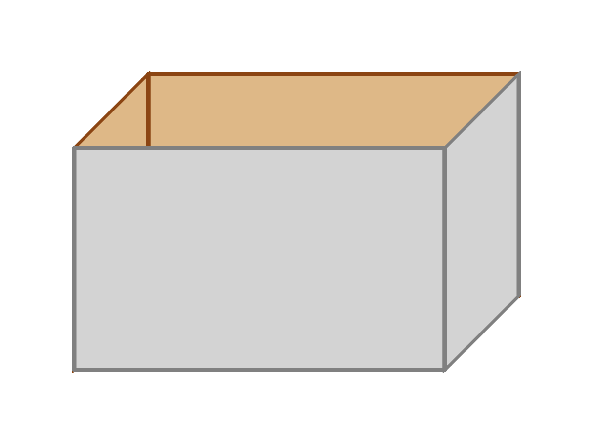
The affine transformations used in 2D SVG cannot shrink one end of a shape more than the other. That’s why it doesn’t look quite right.
Note
In the real world, you only get angled perspective without depth perspective when you’re looking through a telescope or a high-zoom camera: in that situation, you’re so far away from the object that its depth is insignificant.
By default, the CSS 3D transformations work this way as well: as if you’re looking at the box from infinitely far away, but zoomed in. However, a separate perspective property allows you to control the theoretical “point of view” from which the flattened image is calculated.
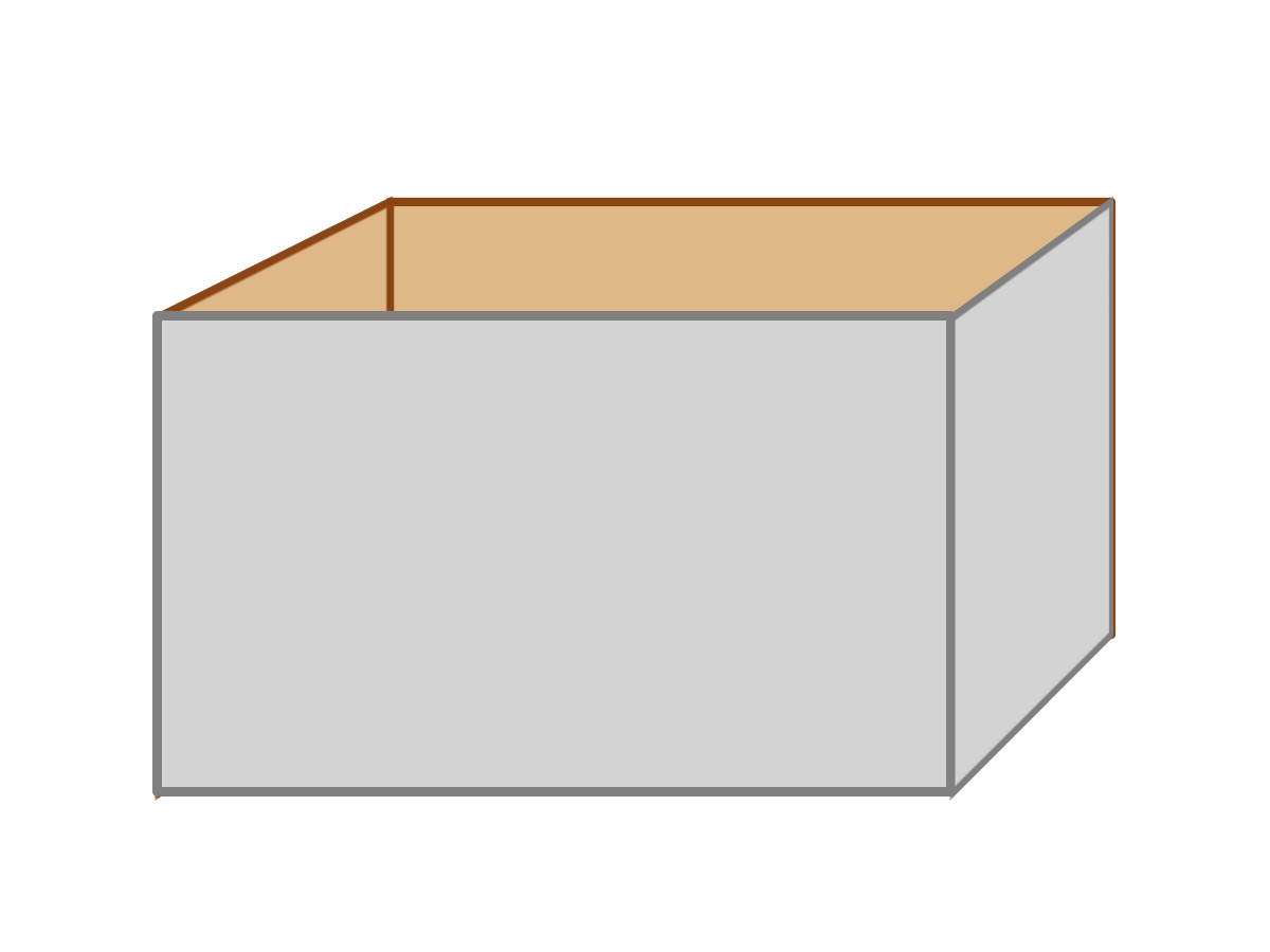
To demonstrate, we’ll re-create our basic box graphic, first without perspective, then with it. The sides of the box are redrawn using 3D transformations to position them, instead of skews. The back will be translated along the z-axis to position it behind the front, and the sides will be rotated at 90° around the vertical axis.
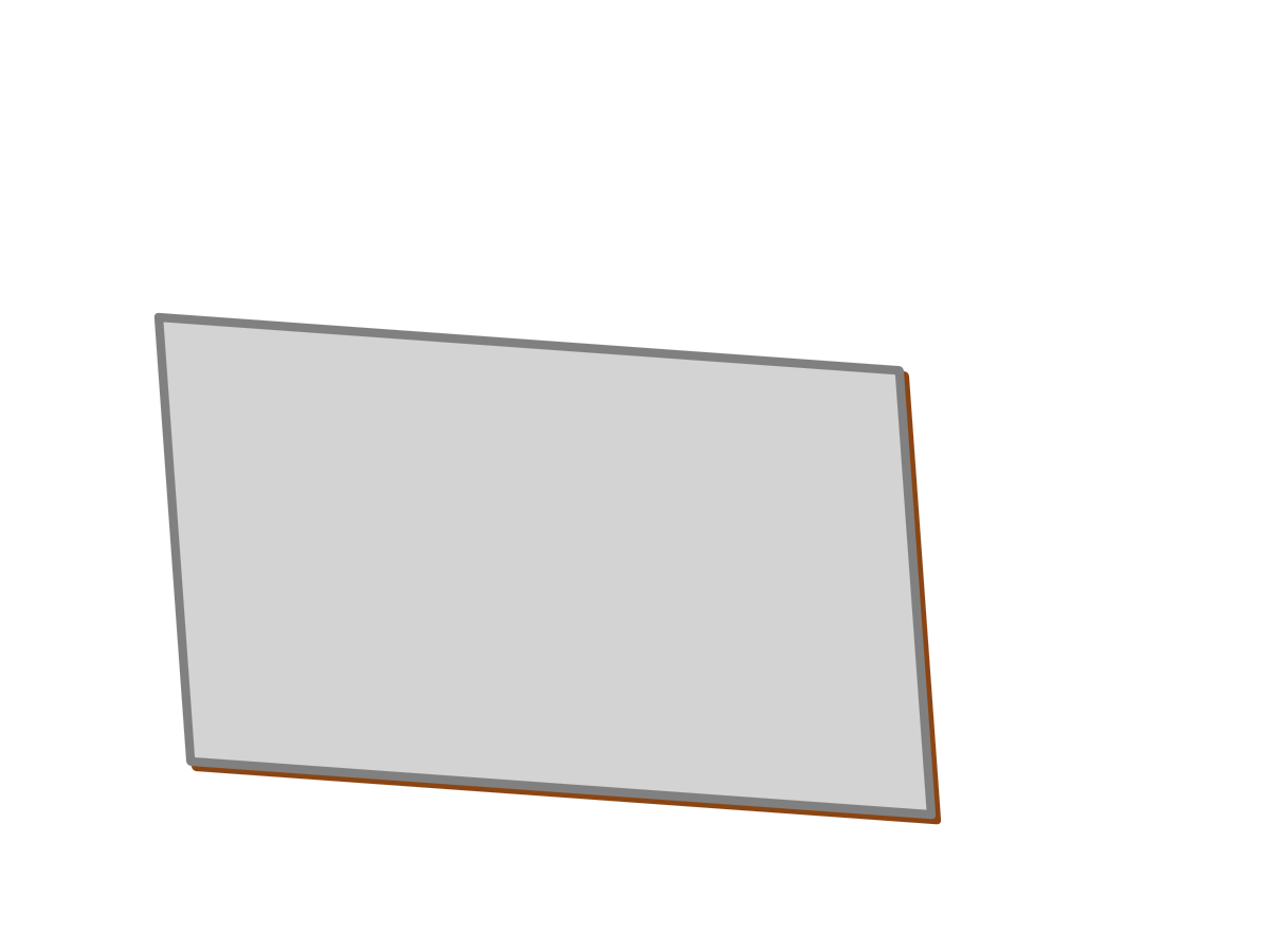
There’s a problem, though. If the front of the box is facing us, and the sides of the box are at exact right angles, the front is all that we’ll see. In order to be able to see the sides and back of the box, we need to rotate the entire object slightly in 3D space, tilting the open top and one side towards the viewer.
Logically, rotating the entire object should be achievable by transforming a <g> containing all the sides of the box. But it’s a little more complicated than that.
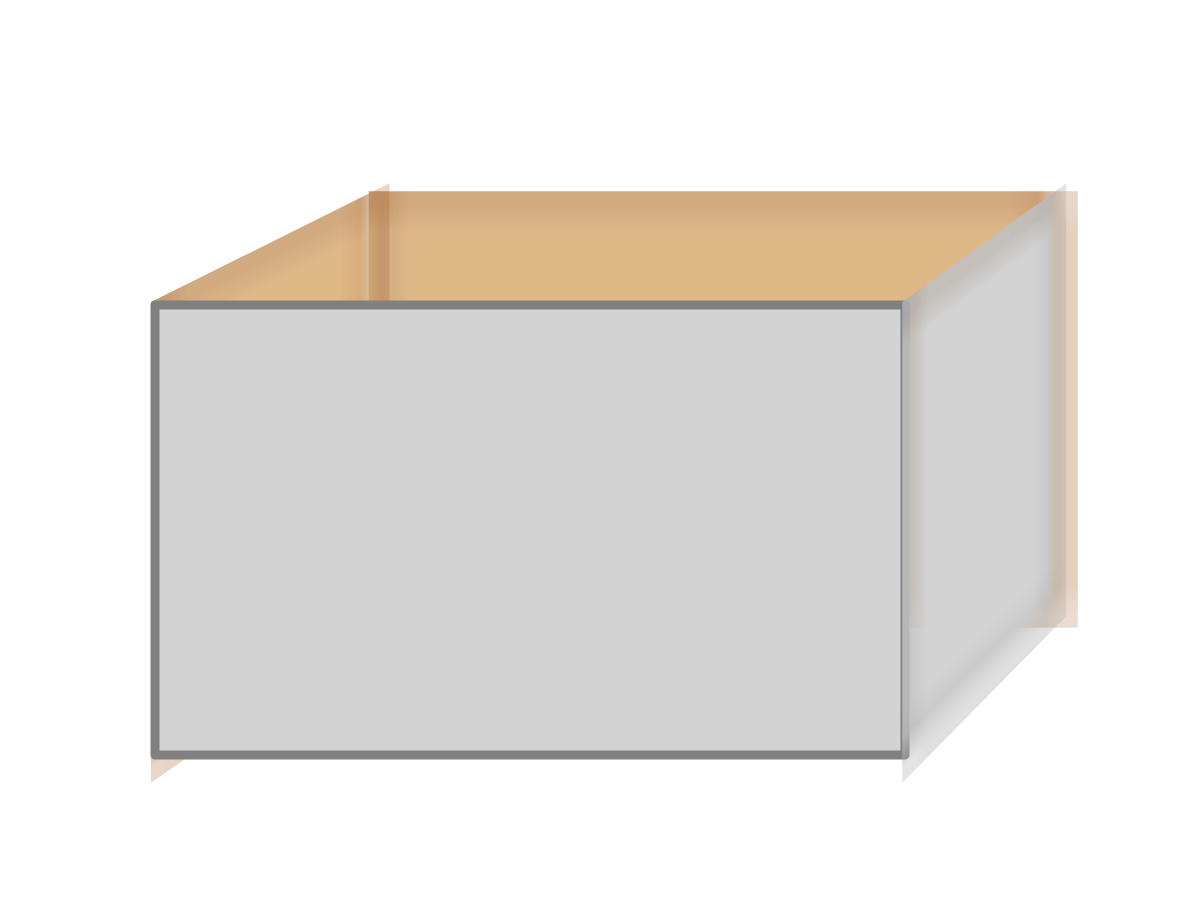
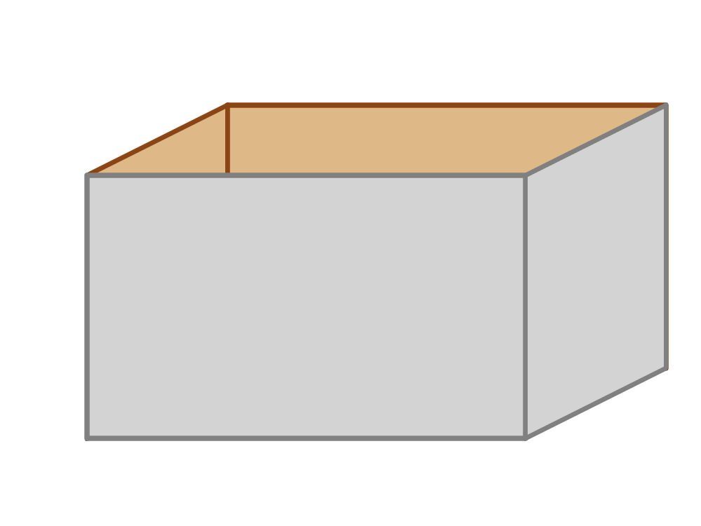
By default, the browser calculates the 2D representation of 3D-transformed elements individually—it flattens them one at a time. Each shape is re-drawn in the main plane of the graphic before any transformations on parent elements are calculated. For building a box, that won’t do: Since the sides of the box are rotated 90° from the plane of the main graphic, they become invisible when flattened. The back of the box, when flattened, is completely hidden by the front. Rotating the entire flattened group results in a skewed grey rectangle with no depth at all, as shown in Figure 11-X3.
To create nested structures of elements transformed in 3D space, the CSS Transforms module defines a new property. An element with transform-style: preserve-3d can have a transformation of its own, without flattening its children. Instead, each child element’s 3D coordinates while transforming the parent group.
Example 11-X1 provides the code for how this should work. Unfortunately, preserve-3d and SVG are currently not well-behaved in web browsers, so this example is mostly theoretical at the time of writing.
Example 11-X1. Using 3D transformations to build a box in preserve-3d space
<svgxmlns="http://www.w3.org/2000/svg"xml:lang="en"xmlns:xlink="http://www.w3.org/1999/xlink"width="400px"height="300px"viewBox="0 0 40 30"><title>3D transformations</title><styletype="text/css">.box{transform-style:preserve-3d;}rect{stroke-width:0.3;stroke-linejoin:round;}.inside{fill:burlywood;stroke:saddleBrown;}.outside{fill:lightGray;stroke:gray;}</style><gclass="box"style="transform: translate(5px,10px) rotate3d(1,1,0,-30deg)"><rectclass="inside"width="25"height="15"style="transform: translateZ(-10px)"/><rectclass="inside"width="10"height="15"style="transform: rotateY(90deg)"/><rectclass="outside"width="25"height="15"/><rectclass="outside"width="10"height="15"style="transform: translate(25px,0) rotateY(90deg)"/></g></svg>

The
preserve-3dstyle is applied to the<g>element, so that the box as a whole can be tilted towards the viewer without losing its three-dimensionality. The rest of the styles haven’t changed from Example 11-10, which drew the box using skews.
The transformations are all declared using CSS syntax in
styleattributes (browsers do not yet support 3D transformations within the SVGtransformattribute). Therotate3dfunction rotates the box around a line going from the origin (top left front corner) down across the front of the box at a 45° angle. The negative rotation angle tilts the bottom-left corner back and the top-right corner forward.
The first rectangle is the back panel, positioned using
translateZ.
The second rectangle is the left side, swiveled into place using
rotateY. The rectangle is 10 units wide (i.e., the box is 10 units deep), but will take up less space on screen because of the angled perspective.
The third
<rect>is the front of the box. The only transforms that apply are those declared on the parent<g>.
The final
<rect>is the right side of the box; it is shifted over withtranslate, then swiveled into place withrotateY.
There are two other options for the transform-style property: auto (the default) and flat. They both have the same effect on an element that has 3D transformations applied, causing the 3D effect to be flattened. The difference is when a child element has preserve-3d effects but the parent isn’t transformed: a flat parent element forces the child content to be flattened, while an auto transform-style doesn’t affect the rendering of child content.
Tip
Various other CSS style properties will force a flattening of 3D child content, such as partial opacity, filters, clipping, or hidden or scrolling overflow. preserve-3d will be ignored in these cases.
Example 11-X1 is “mostly theoretical” because at the time of writing, no browser renders it nicely.
Warning
At the time of writing, Blink and WebKit browsers do not respect the preserve-3d option on SVG content.
Firefox applies the transforms, but it draws the shapes at a scale of one screen pixel per SVG user unit, then scales them up like raster images, creating a blurry mess. Up until version 55, Firefox also had problems with the layering of the shapes. Recent versions of Firefox also do not support the auto value of transform-style (for SVG or HTML): any element that isn’t explicitly preserve-3d applies a flattening effect.
If need be, you can reduce—but not eliminate—browser support problems by transforming CSS layout boxes instead of SVG, using inline SVG in HTML: draw each SVG shape in its own <svg> element, each of which is absolutely positioned to fill a shared <div> container, and transform the <svg> elements instead of the shapes.
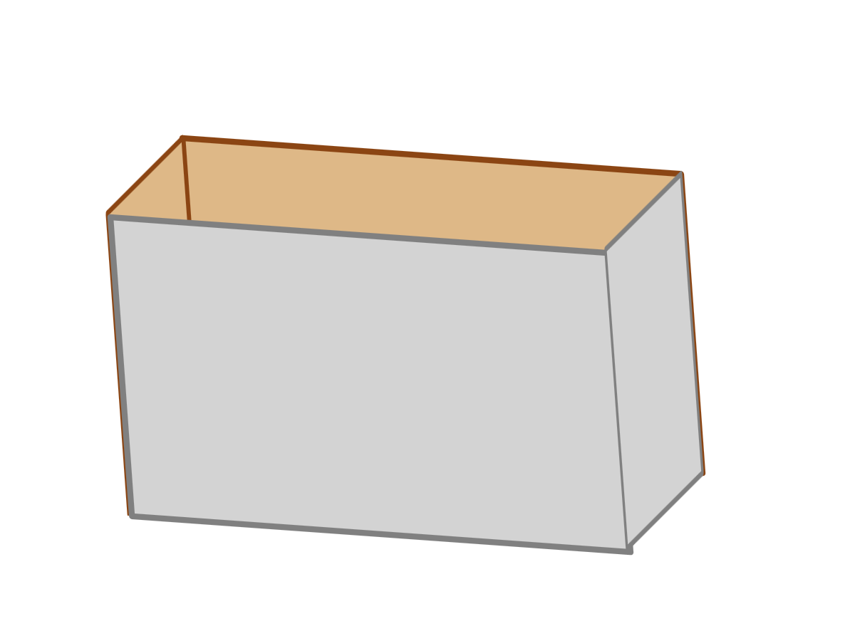
Alternatively, you can create complex 3D objects without the preserve-3d option. To do so, you need to specify the entire sequence of 3D transformations on each element. In other words, remove the transform property for the <g>, and copy that list of functions into the beginning of the transform property for each child rectangle—including the front of the box, which doesn’t have its own transformation!
The changed code is given in Example 11-X2; the result in most new browsers is shown in Figure 11-X4.
Because we’re focusing on compatibility here, another change has been made: fallback support for browsers which don’t apply CSS 3D transforms to SVG at all. The transform attributes, with skew effects, ensure that these browsers will still get the rendering from Figure 11-X2. In other browsers, the skews in the transform attribute will be replaced by the 3D functions in the transform property of the inline styles.
Example 11-X2. Using 3D transformations to build a box, without needing `preserve-3d`
<svgxmlns="http://www.w3.org/2000/svg"xml:lang="en"xmlns:xlink="http://www.w3.org/1999/xlink"width="400px"height="300px"viewBox="0 0 40 30"><title>3D transformations</title><styletype="text/css">.box{/*transform-style: preserve-3d;*/}rect{stroke-width:0.3;stroke-linejoin:round;}.inside{fill:burlywood;stroke:saddleBrown;}.outside{fill:lightGray;stroke:gray;}</style><gclass="box"transform="translate(5,10)"><rectclass="inside"width="25"height="15"transform="translate(5,-5)"style="transform: rotate3d(1,1,0,-30deg) translateZ(-10px)"/><rectclass="inside"width="10"height="15"transform="skewY(-45) scale(0.5,1)"style="transform: rotate3d(1,1,0,-30deg) rotateY(90deg)"/><rectclass="outside"width="25"height="15"style="transform: rotate3d(1,1,0,-30deg)"/><rectclass="outside"width="10"height="15"transform="translate(25,0) skewY(-45) scale(0.5,1)"style="transform: rotate3d(1,1,0,-30deg) translate(25px,0) rotateY(90deg)"/></g></svg>
The problematic
transform-style: preserve-3dis removed.The 2D translate is left behind on the
<g>element, since it doesn’t cause any problems. Since it will also be part of the fallback rendering, it is written in the SVG 1transformattribute syntax.The
rotate3dfunction—originally designed to rotate the box as a whole—has been copied into the start of thetransformstyle property of each side of the box. Atransformattribute uses 2D transformations to create the fallback layout.The fallback transformation on the sides of the box is slightly different from Example 11-10: because the rectangles are twice as wide in this case, they need to be scaled down with
scale(0.5,1).The front of the box did not have any transformations in the skew or preserve-3d code, but it still needs the “inherited”
rotate3dtransformation, to keep it aligned with the rest of the box.
The box in Figure 11-X4 still doesn’t look quite right. And it’s more than just that the strokes on the rectangles throw off the exact alignment of the box’s sides.
The perspective is still wrong. Most of us are not used to seeing three-dimensional objects as if we were viewing them through a highly magnified telephoto camera lens.
To create a more natural perspective on your 3D web design, CSS Transforms defines the perspective and perspective-origin properties to set the position of the viewer, in 3D space, that the browser should use when calculating the flattened representation of the graphic. These properties are defined on a parent element, to create a context for 3D transformations of the children.
Warning
perspective and perspective-origin are only supported in browsers that support a preserve-3d context. Which at the time of writing means only in Firefox, for SVG elements.
The value of perspective is the distance of the viewer above the drawing surface, as measured in units for the current coordinate system’s z-axis. The default value is none, which creates the telephoto perspective effect. Very large perspective distances—relative to the size of the screen in the current coordinate system—create a similar result. Very short perspective distances create strong distortions in size between parts of the graphic with low and high z-coordinates. If the z-coordinate of a shape (or part of a shape) is greater than the perspective distance, it will be “behind” the viewer and not drawn.
The perspective-origin is the (x,y) position of the viewer, relative to the 2D transform-origin; it can be specified using lengths, percentages, or CSS position keywords such as top or center.
Tip
Because the perspective effect is all about angles, the values of perspective and perspective-origin need to be considered together. At very short perspective distances, even slight perspective-origin offsets can have significant effects.
Both perspective and perspective-origin are applied to a container element, to describe the perspective you wish to use when flattening their child elements. This allows multiple transformed elements to have a shared point of view, defined in the container’s coordinate system.
Example 11-X3 uses these properties to take another go at drawing the box. This time, it remains flat within its coordinate system. Instead of tilting the box towards the viewer, we are going to move the viewer (perspective origin) so that it can see inside the box. The interior and right side are displayed using perspective effects.
Once again, we’re going to create the effect twice: first, the theoretical code, using preserve-3d, perspective and perspective-origin. Then we’ll do it all again with cross-browser-compatible code. Figure 11-X5 shows how the code in Example 11-X3 displays in the one browser that currently supports it, Firefox (albeit with blurry scaling issues).
Example 11-X3. Using 3D transformations to build a box, and 3D perspective to display it
<svgxmlns="http://www.w3.org/2000/svg"xml:lang="en"xmlns:xlink="http://www.w3.org/1999/xlink"width="400px"height="300px"viewBox="0 0 40 30"><title>3D perspective on transformed shapes</title><styletype="text/css">.scene{perspective:100px;perspective-origin:80px-40px;}.box{transform-style:preserve-3d;}rect{stroke-width:0.3;stroke-linejoin:round;}.inside{fill:burlywood;stroke:saddleBrown;}.outside{fill:lightGray;stroke:gray;}</style><gclass="scene"><gclass="box"style="transform: translate(5px,10px)"><rectclass="inside"width="25"height="15"style="transform: translateZ(-10px)"/><rectclass="inside"width="10"height="15"style="transform: rotateY(90deg)"/><rectclass="outside"width="25"height="15"/><rectclass="outside"width="10"height="15"style="transform: translate(25px,0) rotateY(90deg)"/></g></g></svg>
A new group (
.scene) defines theperspectiveandperspective-originproperties that will apply to its children. The perspective origin is off to the right of the SVG’s dimensions (80px being much wider than the 40pxviewBoxwidth), and above (-40px meaning above the origin).Although the box itself no longer has a 3D rotation, it still needs a
preserve-3dsetting, so that the perspective properties set on its parent will affect its children.Only the 2D transformation remains on the
.boxgroup; however, the 3D transformations used to position the individual<rect>elements have not changed since Example 11-X1.
Tip
The blurry effects in Figure 11-X5 are created by the browser drawing the graphic in the SVG user-unit coordinate space, then scaling it up to the final dimensions. You can avoid it by defining your SVG viewBox to be equal or larger than the actual dimensions it will be drawn at.
The perspective effects are defined on a new <g> element that contains the box. This allows them to be defined in the SVG’s viewBox coordinate space. In contrast, if the perspective was defined on the parent <svg>, it would be measured in the “outside” coordinate space: the units used to measure the <svg> element’s width and height. (It would also break in Firefox, which treats an SVG viewBox as a flattening transform.)
So, that was the theoretical code, using perspective and preserve-3d. But neither are supported in Blink and WebKit for SVG: they just show the plain gray rectangle of the front side of the box.
In Figure 11-X4 (without perspective effects), we worked around the missing 3D SVG context by pushing the parent transformations down the tree. Transformations for the group as a whole were specified as part of the transform function list for the child <rect> elements. We’re going to do that again, but in order to so, we need a way to describe the perspective effects in a transform function list.
The uneven scaling effect of perspective can also be created using a perspective(dz) transformation function within the transform list. The value in the brackets is the perspective distance length, the same as a value for the perspective property. A perspective property on a parent element is equivalent to a perspective() function with the same length, added at the beginning of the child’s transformation list.
There is no function equivalent to the perspective-origin property. Instead, like with transform-origin, perspective-origin is equivalent to before-and-after translations: this time, the translations are applied before and after the perspective() function.
Tip
This assumes that the reference coordinate system for perspective-origin is the same for the parent as the child element. With SVG, this works so long as you’re using viewBox coordinates, which currently means absolute lengths only: percentages suffer from the same browser bugs as transform-origin.
Example 11-X4 shows the final code, including fallback transform attributes to create the original skew effect for MS Edge and older browsers. While we’re fixing things, the blurry rendering in Firefox has been fixed by scaling every length value in the code (from the viewBox to the stroke-width) by 10. Figure 11-X6 shows the result in Firefox 54.
Example 11-X4. Integrating 3D perspective effects in an individual element’s transformation sequence
<svgxmlns="http://www.w3.org/2000/svg"xml:lang="en"xmlns:xlink="http://www.w3.org/1999/xlink"width="400px"height="300px"viewBox="0 0 400 300"><title>3D perspective on transformed shapes</title><styletype="text/css">rect{stroke-width:3;stroke-linejoin:round;}.inside{fill:burlywood;stroke:saddleBrown;}.outside{fill:lightGray;stroke:gray;}</style><gtransform="translate(50,100)"><rectclass="inside"width="250"height="150"transform="translate(50,-50)"style="transform: translate(800px, -400px)perspective(1000px) translate(-800px, 400px)translateZ(-100px)"/><rectclass="inside"width="100"height="150"transform="skewY(-45) scale(0.5,1)"style="transform: translate(800px, -400px)perspective(1000px) translate(-800px, 400px)rotateY(90deg)"/><rectclass="outside"width="250"height="150"style="transform: translate(800px, -400px)perspective(1000px) translate(-800px, 400px)"/><rectclass="outside"width="100"height="150"transform="translate(250,0) skewY(-45) scale(0.5,1)"style="transform: translate(800px, -400px)perspective(1000px) translate(-800px, 400px)translate(250px,0) rotateY(90deg)"/></g></svg>
Figure 11-X7 shows the rendering in Chrome 57; Safari 10 looks the same. It’s not quite right (the back edges should be smaller than the front, not larger), but it’s a significant improvement on the no-depth gray rectangle.
If we could create an acceptable fallback for preserve-3d and perspective-origin by simply shifting all the transformation functions into the child elements, why can’t the smart folks on the Blink and WebKit teams do the same? Because not all examples are this simple.
The fallback approach given here—transforming each element individually—only works if the painting order of the elements doesn’t change when they are transformed in 3D space. The back, sides, and front of the box are still being painted individually, in the order they are specified in the SVG file. In contrast, in a true preserve-3d space, elements might end up transformed so they are behind or in front of other elements, or even so they intersect. Getting the paint order correct in those cases is one of the most difficult parts of 3D rendering.
To finish off the discussion of 3D transformations, Example 11-X5 re-draws the shadowed text from Example 11-11 using a rotateX transformation to position the shadow, and perspective effects to display it.
Again, we’ve maximized compatibility by stacking all the transformations, including the perspective origin, in the child elements. In browsers that don’t support 3D transforms on SVG, fallback transform attributes ensure a rendering identical to Figure 11-11, with the shadow created by skews. Figure 11-X8 is the result with 3D effects (in Firefox).

Example 11-X5. Using 3D transformations to cast a shadow
<svgxmlns="http://www.w3.org/2000/svg"xml:lang="en"xmlns:xlink="http://www.w3.org/1999/xlink"width="400px"height="140px"viewBox="0 0 400 140"><title>3D shadows</title><styletype="text/css">.container{/* perspective: 500px; perspective-origin: 1000px -550px; */}.container>*{transform:translate(1000px,-550px)perspective(500px)translate(-1000px,550px);}.shadow{transform:translate(1000px,-550px)perspective(500px)translate(-1000px,550px)rotateX(90deg)scale(1,0.5);}text{font:bold144pxGeorgia,serif;}</style><defs><linearGradientid="fadeGray"y2="100%"x2="0%"><stopstop-color="gray"stop-opacity="0"offset="0"/><stopstop-color="gray"stop-opacity="1"offset="1"/></linearGradient></defs><gclass="container"transform="translate(10,120)"><useclass="shadow"xlink:href="#t"fill="url(#fadeGray)"transform="skewX(-45) scale(1,0.7)"/><gfill="blue"stroke="navy"><textid="t">SVG</text></g></g></svg>
The
perspective-originandperspectiveproperties are included, commented-out, to show the effect we are trying to achieve.Because of the lack of support, the perspective effects are instead created with a
transformsequence on the container’s child elements.In addition to the perspective effect, the shadow is shifted into a horizontal plane using
rotateX(90deg); a scaling factor is still used, since the height of a shadow will often be different from the height of the object that casts it.The container and the shadow both have
transformattributes so that they will be positioned properly in browsers that don’t apply CSS transforms on SVG. In browsers that do support them, the skewed transform on theshadowelement will be over-ridden by the value set in CSS. However, the transform on thecontainerelement does not need to change, so it hasn’t been over-ridden.
This graphic has been designed to be almost the same as the version created using skewed 2D coordinates, so the perspective effect is subtle. However, the far edge of the shadow is slightly narrower than its base.
The screenshot in Figure 11-X8 is from Firefox 54. Again, the perspective effects look slightly different in Chrome and Webkit: the shadow ends up streched out, as shown in Figure 11-X9, from Chrome 57.

The exact mathematics for applying perspective effects to 3D transformed graphics are somewhat complex, and require calculating intersections, clipping shapes that extend behind the “viewer”, and finally some trigonometry to get the scale and position correct for every point, relative to the perspective distance and origin. Many of these calculations are not explicitly defined in CSS. The lesson being: when using 3D transformations of SVG, test thoroughly, and accept a little bit of inter-browser differences.
In contrast, the mathematics for the underlying transformations in the theoretical 3D space are simply three-dimensional versions of the affine transformations used in 2D. Again, the key to simple calculation is matrix multiplication.
The 3D transformation matrices have an extra row and column to describe the z-coordinate. They also make use of the final row of the matrix to hold information about the perspective distance. However, the final conversion of the 3D coordinates to a flattened representation cannot be described using the same matrix structure.
If you’re calculating out 3D transformations yourself, there’s a matrix3d transformation function: it requires all 16 of the matrix values to be specified, in column order: top-to-bottom, then left-to-right.