Planning for Performance
No matter what language you use to create an animated effect—CSS properties, SVG/SMIL elements, or JavaScript code—the browser still needs to update the graphic and render it to the screen.
The process of turning SVG code into pixels follows roughly these steps every time you change something:
-
The DOM objects (elements and attributes) are initialized or updated. If the browser identifies new files that it needs (such as embedded images or
<use>cross-references), it starts the HTTP processes to fetch them. -
Any new CSS styles are parsed, style rule selectors are matched against elements, multiple declarations are cascaded to find a specified value for each element, and then inherited styles are calculated from the DOM and relative units, percentages, variables and
currentColorare all computed to find the final styles. -
The layout is calculated. For SVG, that means calculating transforms and
viewBoxscaling, and using them to calculate the the fill-region and bounding box of shapes, and the stroke-region too if it is needed. -
As part of the layout, text is positioned to generate the outlines and bounding boxes of individual letters. This is usually calculated by a dedicated program that handles all the complexities of fonts and OpenType. But for SVG, there are a lot of additional layout complexities that the normal “text shaper” program may not handle.
-
The individual paint layers—images, gradients, patterns—are calculated based on the relevant layout scales. For patterns, that means running all the steps for rendering a separate SVG image.
-
Paint layers are clipped to fit within the layout shapes (fill-region, stroke-region, and CSS layout boxes), and are layered together to create the final image of each element. Markers are added as well, which again means drawing entire SVG images.
-
Any filters are applied to the element, then clipping and masking (after scaling the clipping paths or masks as required).
-
Elements are composited (layered) together, adjusting for opacity and blend modes to calculate a combined image layer.
-
The process is repeated with more filters, clipping, and masking on groups (combined image layers) until the entire document has been composited together.
This description is necessarily vague, because different browsers have different details. Even within the same browser, you’ll get different computation pathways depending on the operating system and hardware.
Some or all of the steps will be repeated every time you animate something. Usually, if you have to repeat something high up in the list, you have to repeat the following items too.
But there are shortcuts.
The next few sections look at some of the ways you can optimize your animations to minimize the amount of work the browser has to do at each frame update. Less update work means faster framerates, smoother animations, and web sites that react more naturally to user interactions.
We finish up with a practical example, rearranging an animation to create optimum performance.
Warning about future changes#
For declarative animations (CSS, SVG/SMIL, and the Web Animations API), the browser doesn’t need to do any DOM and style computations for subsequent animation frames, allowing it to jump straight to the rendering steps.
Declarative animations also allow the browser to plan ahead for future changes. If the browser knows that you are going to be scaling up the graphic, it can calculate it at a higher-than-normal resolution ahead of time, so the scaling can use GPU-optimized image scaling instead of re-doing the rasterization at each frame.
The CSS will-change property exists so that you can warn the browser about future changes, even when you will be animating with JavaScript. So the following tells the browser to optimize as if transform and opacity are about to be animated on this element:
will-change:transform,opacity;
Warning
MS Edge and Internet Explorer don’t recognize will-change. Nor do Safari versions 9 and under.
Even where supported, the effects of will-change can be unpredictable, and vary from one browser to the next. The transform property is particularly problematic, because the correct browser optimizations for a scaling transform are different from the optimizations for a translate transform.
Tip
will-change can also affect stacking contexts and isolation layers. If any value of a property would affect stacking or isolation, declaring that it “will change” has the same effect—but only in browsers that support will-change in the first place.
Beyond their ability to warn the browser what’s coming, declarative animations can sometimes be more efficient because they aren’t affected by other JavaScript code running on your page.
But that’s about as far as rendering performance is affected by which animation method you use.
Picking Your Properties#
The biggest technical challenge of web animation is not selecting a syntax, it’s designing the animation for fast rendering. The difference between a smooth, life-like animation and a janky, stuttery one is rarely as simple as CSS versus JavaScript. Instead, it’s often determined by which properties or attributes you animate, on which elements.
Regardless of whether you’re changing a style property with CSS or with SMIL or with JavaScript, the browser needs to determine which pixels on the screen need to be updated, and how.
If the DOM and style computation steps determine that no styles or SVG rendering attributes have changed for any elements, the browser can stop right there.
If the changed styles don’t affect layout (only painting), or if layout has changed for some elements but not for others, the browser has to determine which parts it needs to repaint. This region is known as the “dirty” rectangle of the screen. Elements elsewhere on the screen can be skipped, their pixels unchanged for this update.
The changed element usually needs to be repainted, but also maybe others. Did the changed element overlap another element, which is now revealed? If so, the browser may need to redraw that background element.
But maybe not.
It depends on whether the browser has the original pixel data for the background saved in memory. The graphical processing units (GPU) in most modern computers and smartphones can keep a certain number of rendering layers in memory, not just the final version that appears on screen. The main browser program may also save partial images in memory.
Much of browser rendering optimization comes down to how it selects which parts of the rendered document to divide into separately cached (saved) layers.
GPUs can perform certain operations on the cached rendering layers, and are highly optimized for the limited number of operations they can do.
If browsers know that an element is going to change in a way that can be efficiently calculated by the GPU, they can save that image’s pixel data in a different GPU layer from its background (or foreground). The animated changes can therefore be applied by sending new instructions to the GPU for how to combine the saved pixels, instead of by calculating new pixel values in the main processor.
Tip
Most browser Dev Tools now have options to highlight the “dirty” paint rectangles whenever they are updated. If your animation is being GPU-optimized, you won’t see any colored rectangles flashing when you run this Dev Tools mode.
Of course, all GPU-optimized pathways are conditional on having a compatible GPU available—and on the browser knowing how to use it, which may depend on the operating system. So browser performance, and sometimes even browser bugs, will depend not just on the browser version but also on the OS and hardware.
Most GPUs can adjust opacity of the saved layers, and translate them to different relative positions before combining them. They can also perform image scaling, usually including 3D perspective scaling—but the scaling is calculated on a pixel level, not a vector level, and can cause a visible loss in resolution. More advanced GPUs can calculate some filter operations and blend modes, and masking of one image layer with an alpha mask layer.
Some GPUs also have optimized vector rasterization, which can calculate high-resolution vector shapes for use as clipping paths of other vector levels. These “clipping paths” aren’t only used for clip-path effects, though. Filling and stroking a shape is clipping the paint image layer to the fill-region or stroke-region vector outline. Similarly, CSS border-radius effects are vector clipping paths on the content and background image layers.
But you currently can’t rely on your end users having these optimized pathways.
The best performance, across a wide range of browsers and hardwares, comes from animations that can be broken into layers (of elements, groups, or individual <svg> graphics) that are animated in the following ways:
-
opacitychanges -
translational and rotational transformations
Warning
Currently, Chrome never divides an SVG graphic into different GPU layers (although they do other optimizations).
To create a fully GPU-optimized animation in Chrome, you can sometimes position separate inline <svg> elements over top of each other, creating your own layers.
If you can’t define your animation entirely in translation and opacity layers, consider the following guidelines:
-
Minimize the size of the “dirty” rectangle at each frame.
-
Solid-color objects are better than semi-transparent ones, since the browser doesn’t need to calculate pixel updates for shapes that can’t be seen behind a solid object. (Although this may not apply if the browser is using GPU layers for optimization.)
-
Moving elements around is more efficient than changing what they look like. (Although it depends on the browser whether “moving around” only applies to
transformmovements or also to other absolute position changes.) -
Changing fill and stroke is more efficient than changing shapes and sizes.
-
Scaling transformations are better than changing the underlying geometry; browsers may be able to use GPU image scaling for an animated scale effect, instead of recalculating the vector image at the correct resolution at each frame.
-
Clipping is usually more efficient than masking.
-
Avoid rescaling gradient and pattern layers; this could mean using user-space effects instead of bounding-box effects, if the bounding box is changing.
-
Avoid any changes that require a filter to be recalculated. That includes any change to the filtered element or its child content.
With those guidelines in hand, we’re ready to tackle a practical example.
The ghost in the animation#
The example started out as a variation on Example 19-X2 (from the “Using SVG/SMIL Animation Elements” article). In the original version, we used an animated clipping path to show parts of an “X-ray” skeleton photo instead of the normal photo.
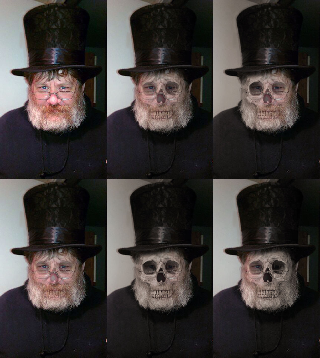
The planned variation was to use an animated gradient mask instead of the clipping path, so that the skeleton image would appear to flicker in and out. Different parts would be visible at different times, but there would be no sharp clipping edges between the two photographs. Figure 19-X5 shows various frames from the animation, to demonstrate the effect.
Now, we’ve already said a few times that clipping is more efficient than masking. So it may be no surprise that the first try at a mask animation created a janky, stuttering effect in nearly every browser.
Example 19-X4 provides the code from this first attempt.
To create a declarative animation that works without SVG/SMIL support, it uses CSS to animate the stop-color and stop-opacity of the gradient used by the shape in the <mask>. To create the appearance that the stops are moving across the page, each stop cycles through the colors or opacity values at slightly different delay from the previous one. To create some pseudo-random varation, the keyframes are unevenly spaced and the cicada principle is used, with the color and opacity animations cycling at different rates.
Example 19-X4. An animated mask effect, by animating gradient stops within the mask
<svgxmlns="http://www.w3.org/2000/svg"xml:lang="en"xmlns:xlink="http://www.w3.org/1999/xlink"width="430"height="720"viewBox="0 0 860 1440"><title>The Masked Man</title><style>stop{animation-name:luminance,alpha;animation-duration:7s,3s;animation-iteration-count:infinite;animation-direction:alternate,normal;}stop:nth-of-type(1){animation-delay:-0.2s;}stop:nth-of-type(2){animation-delay:-0.5s;}stop:nth-of-type(3){animation-delay:-0.7s;}stop:nth-of-type(4){animation-delay:-1s;}stop:nth-of-type(5){animation-delay:-1.2s;}@keyframesluminance{0%,80%,100%{stop-color:black;}40%{stop-color:white;}}@keyframesalpha{0%,50%,100%{stop-opacity:0.5;}20%,70%{stop-opacity:1;}}</style><defs><linearGradientid="linear"gradientTransform="rotate(10)"><stopoffset="0"/><stopoffset="0.2"/><stopoffset="0.4"/><stopoffset="0.6"/><stopoffset="0.8"/><stopoffset="1"/></linearGradient><maskid="the-mask"maskContentUnits="objectBoundingBox"><rectwidth="1"height="1"fill="url(#linear)"/></mask></defs><imagewidth="100%"height="100%"xlink:href="TopHatKurt.jpg"/><imagemask="url(#the-mask)"width="100%"height="100%"xlink:href="TopHatSkull.jpg"/></svg>
The result is somewhat ghastly, but not in the way intended. Performance varied by browser. In Firefox it was especially jerky, jumping from one image to the next—instead of smoothly and subtly transitioning, as hoped. Other browsers looked better, but a whirring laptop fan confirmed that the computer processor was desperately trying to keep up with all the calculations being asked of it.
What is the problem? At every frame of the animation, we’re asking the browser to calculate a completely new gradient, and then use that gradient to apply a masking effect on the skeleton image.
So the next iteration of the code removed one of those steps. Instead of drawing a new gradient for each frame, why not move around a gradient we already have?
Example 19-X5 shows the revised code. The gradient stops now have a fixed pattern, and are used to fill a rectangle that is slightly larger than the 1×1 dimensions of the bounding-box mask. A CSS animation applies transformations (translations and rotations) to the rectangle in a somewhat-erratic pattern.
Example 19-X5. An animated mask effect, by animating the position of a gradient-filled rectangle within the mask
<svgxmlns="http://www.w3.org/2000/svg"xml:lang="en"xmlns:xlink="http://www.w3.org/1999/xlink"width="430"height="720"viewBox="0 0 860 1440"><title>The Masked Man</title><style>maskrect{animation:translateX7salternateinfinite;}@keyframestranslateX{0%{transform:translateX(-0.7px)rotate(10deg);}20%{transform:translateX(+0.3px)rotate(5deg);}40%{transform:translateX(-0.3px)rotate(-5deg);}60%{transform:translateX(+0.7px)rotate(10deg);}80%{transform:translateX(+0.3px)rotate(5deg);}100%{transform:translateX(+0.5px)rotate(-8deg);}}</style><defs><linearGradientid="linear"><stopoffset="0"/><stopoffset="0.1"stop-color="white"/><stopoffset="0.2"stop-color="#444"/><stopoffset="0.3"/><stopoffset="0.7"stop-color="white"/><stopoffset="0.9"stop-color="#444"/><stopoffset="1"/></linearGradient><maskid="the-mask"maskContentUnits="objectBoundingBox"><rectx="-0.8"y="-0.2"width="3"height="1.4"fill="url(#linear)"id="r"/></mask></defs><imagewidth="100%"height="100%"xlink:href="TopHatKurt.jpg"/><imagemask="url(#the-mask)"width="100%"height="100%"xlink:href="TopHatSkull.jpg"/></svg>
This resulted in an acceptable appearance in Chrome, but not as nice as the original demo. And it is completely broken in Firefox, thanks to a bug about not updating <mask> content when elements inside have CSS animations that would normally be GPU-optimized.
And of course, it doesn’t animate at all in Internet Explorer or MS Edge, which don’t support CSS transforms of SVG elements.
So that was a bust.
Calculating a new mask effect every frame is just too risky for web performance. You just can’t rely—yet—on having GPU-optimized masking in browsers.
But most devices can optimize regular alpha compositing of semi-transparent layers—including semi-transparent layers created from masked images.
This realization led to the counter-intuitive leap for the final version of the code. To improve the appearance of our masked-image animation, add more masked images. Each image with a different mask, so it reveals a different part of the skull.
Figure 19-X6 shows all the different layers, separated out side-by-side. They are drawn on a checked background so you can easily distinguish the transparent parts of the masked layers.
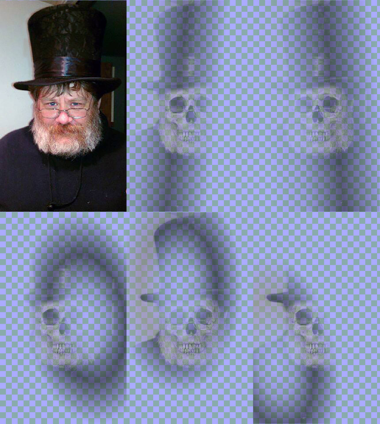
Example 19-X6 gives the code for creating those layers, and animating their opacity. None of the skeleton layers ever reach more than 50% opacity, but some of the layers overlap, to create a cumulative impact. Again, the cicada principle is used, now with five independent time-cycles for the opacity animations of the five masked layers.
Example 19-X6. An animated mask effect, by animating the opacity of multiple layers with different masks
<svgxmlns="http://www.w3.org/2000/svg"xml:lang="en"xmlns:xlink="http://www.w3.org/1999/xlink"width="430"height="720"viewBox="0 0 860 1440"><title>The Masked Man</title><style>#layersimage{animation:fade7salternateinfinite;}#layersimage:nth-of-type(1){animation-duration:3s;}#layersimage:nth-of-type(2){animation-duration:4s;}#layersimage:nth-of-type(3){animation-duration:5s;}#layersimage:nth-of-type(4){animation-duration:6.5s;}#layersimage:nth-of-type(5){animation-duration:7s;}@keyframesfade{0%,20%,60%,90%,100%{opacity:0}10%,80%{opacity:0.5}}</style><defs><linearGradientid="grad1"gradientTransform="scale(0.8) rotate(10)"><stopoffset="0"/><stopoffset="0.3"stop-color="#222"/><stopoffset="0.4"stop-color="#444"/><stopoffset="0.6"stop-color="#888"/><stopoffset="0.8"stop-color="#444"/><stopoffset="0.9"stop-color="#222"/><stopoffset="1"/></linearGradient><linearGradientid="grad2"xlink:href="#grad1"gradientTransform="scale(0.9) rotate(-10)"/><radialGradientid="grad3"xlink:href="#grad1"gradientTransform="translate(0.1) skewX(10)"/><radialGradientid="grad4"xlink:href="#grad1"gradientTransform="translate(-0.2) rotate(-15)"/><radialGradientid="grad5"xlink:href="#grad1"gradientTransform="skewY(10) rotate(30)"/><maskid="mask1"maskContentUnits="objectBoundingBox"><rectwidth="1"height="1"fill="url(#grad1)"/></mask><maskid="mask2"maskContentUnits="objectBoundingBox"><rectwidth="1"height="1"fill="url(#grad2)"/></mask><maskid="mask3"maskContentUnits="objectBoundingBox"><rectwidth="1"height="1"fill="url(#grad3)"/></mask><maskid="mask4"maskContentUnits="objectBoundingBox"><rectwidth="1"height="1"fill="url(#grad4)"/></mask><maskid="mask5"maskContentUnits="objectBoundingBox"><rectwidth="1"height="1"fill="url(#grad5)"/></mask></defs><imagewidth="100%"height="100%"xlink:href="TopHatKurt.jpg"/><gid="layers"><imagemask="url(#mask1)"width="100%"height="100%"xlink:href="TopHatSkull.jpg"/><imagemask="url(#mask2)"width="100%"height="100%"xlink:href="TopHatSkull.jpg"/><imagemask="url(#mask3)"width="100%"height="100%"xlink:href="TopHatSkull.jpg"/><imagemask="url(#mask4)"width="100%"height="100%"xlink:href="TopHatSkull.jpg"/><imagemask="url(#mask5)"width="100%"height="100%"xlink:href="TopHatSkull.jpg"/></g></svg>
The SVG code is a little longer this time, to define all the gradients, masks, and images. But gradient cross-references keep it manageable, and the bytes of SVG markup are negligible compared to the JPEG image sizes, anyway.
The performance is much better, and the final effect is even closer to how it was imagined. The combination of linear and radial gradient masks, as well as the stronger cicada effect, create just the right random-flickering feel.
This example demonstrates a theme we have been repeating since Chapter 1: there are many ways to create a given visual appearance in SVG code. If you are designing your SVG entirely in a visual editor, you won’t necessarily think about all the options. But when you are creating a dynamic experience for the web, that underlying structure can have a big impact.
So if you’re frustrated trying to create an SVG that works the way you want in web browsers, remember to step back and ask: how else could I create the same effect?